Abno Brand Identity by abnodesigns |
Home > Winners > #79063 |
 |
|
||||
| DESIGN DETAILS | |||||
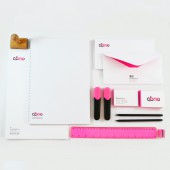
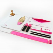
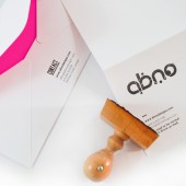
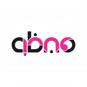
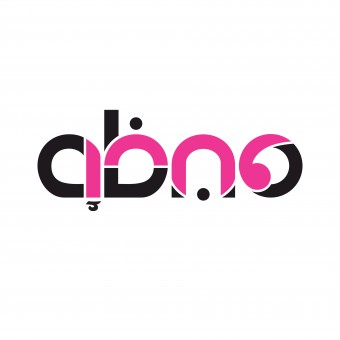
| DESIGN NAME: Abno PRIMARY FUNCTION: Brand Identity INSPIRATION: The brand identity is influenced by the Arabic language and its typography. The designer duo who created the brand thinks, speaks, lives, and breathes in their mother tongue. The bilingualism of the designers allows them to approach design with no preference for right to left, or left to right. They see and understand linguistic patterns and connections, weaving this insight into their branding and identity design. UNIQUE PROPERTIES / PROJECT DESCRIPTION: Abno is an acronym of the names of the designer duo that created the design, Abeer and Noor. The logo portrays the global identities of the designers as a bilingual designers working in both Arabic and English. When displayed online or in print, the logo can be rotated 180 degrees to be read in either language. The text in black reads abno in the Latin alphabet. The text in pink reads abno in Arabic script. The logo is physically represented on business cards and in a rubber ink stamp. OPERATION / FLOW / INTERACTION: The logo can be rotated 180 degrees to be read in either Arabic or English. It conveys the brand identity of the bilingual designers, who work in both Arabic and English. The text in black reads abno in the Latin alphabet. The text in pink reads abno in Arabic script. The rubber ink stamp is used with black ink. PROJECT DURATION AND LOCATION: The initial logo design took place in Toronto, Canada, in 2007. The business cards were first printed in 2008, in Toronto, and again in 2017, in Amman, Jordan. FITS BEST INTO CATEGORY: Graphics, Illustration and Visual Communication Design |
PRODUCTION / REALIZATION TECHNOLOGY: The logo was hand sketched, scanned and then transferred into vectors using Adobe Illustrator. The designers created the business cards using Adobe Illustrator. The stamp was custom made, out of rubber, and is used with black ink. SPECIFICATIONS / TECHNICAL PROPERTIES: The business cards are 90 mm x 50 mm on a 600 gms card, with pink-coloured edges. TAGS: Abno, branding, identity, logo, stationary, bilingual, Arabic, Jordan, Amman RESEARCH ABSTRACT: The idea for the design emerged instinctively. The designer duo created only one iteration of the design, combining both languages to represent their brand identity as a bilingual team of designers, representing both cultures in their designs. CHALLENGE: The designers adapted both languages in a way that does not seem forced. The resulting logo is clean, clear and straight to the point, in both Arabic and English. ADDED DATE: 2019-02-25 14:38:26 TEAM MEMBERS (2) : Abeer Zoumot and Noor Issa IMAGE CREDITS: All Images, Abeer Zoumot and Noor Issa, Abno Designs, 2015. |
||||
| Visit the following page to learn more: http://bit.ly/2HL9m07 | |||||
| AWARD DETAILS | |
 |
Abno Brand Identity by Abnodesigns is Winner in Graphics, Illustration and Visual Communication Design Category, 2018 - 2019.· Read the interview with designer abnodesigns for design Abno here.· Press Members: Login or Register to request an exclusive interview with abnodesigns. · Click here to register inorder to view the profile and other works by abnodesigns. |
| SOCIAL |
| + Add to Likes / Favorites | Send to My Email | Comment | Testimonials | View Press-Release | Press Kit |
Did you like Abnodesigns' Graphic Design?
You will most likely enjoy other award winning graphic design as well.
Click here to view more Award Winning Graphic Design.


