Ragu Communication Stationery Brand Identity by Eleonora Venzaga |
Home > Winners > #79033 |
 |
|
||||
| DESIGN DETAILS | |||||
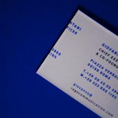
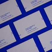
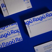
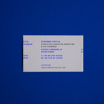
| DESIGN NAME: Ragu Communication Stationery PRIMARY FUNCTION: Brand Identity INSPIRATION: Maybe the love for the simple things, communicating and giving character to a brand with a few elements is never easy. My ideas are that the simple things are the most beautiful. Surely the graphics period that has influenced me the most is Bauhaus. UNIQUE PROPERTIES / PROJECT DESCRIPTION: This design had to reflect stability while creating dynamism. While reflecting brand values such as solidity and versatility. The design turn around the typography. The project pointed to align brand identity, naming, website, and social media strategy around the company’s ideas and desires. Through a sophisticated use of Antenna type, the brand displays a strong personality. A clean editorial grid and different details as the typography that goes ahead through the borders. OPERATION / FLOW / INTERACTION: The new brand identity summarizes the need to change the face of the brand. PROJECT DURATION AND LOCATION: The project started in September 2016 and finished in March 2017. FITS BEST INTO CATEGORY: Graphics, Illustration and Visual Communication Design |
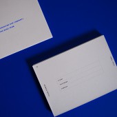
PRODUCTION / REALIZATION TECHNOLOGY: The products are printed in hexachrome, using 286 Pantone Uncoated electric blue shades. Also for the stamp it was thought to use the same Pantone. The products made in addition to the business cards are: generic cards to be sent to customers, letterheads and stamps production. SPECIFICATIONS / TECHNICAL PROPERTIES: 80 mm per 50 mm / 100 mm per 150 mm. The brand identity is composed by, business card, generic card to be sent, letterhead, and stamp production. TAGS: Communication, design, brand identity, editorial, print, pantone, fine arts, client RESEARCH ABSTRACT: In order to understand the creative process it is necessary to carefully observe the context that surrounds us. Starting from a goal is useful in creative development, understanding where to go and what to communicate, in this case, I started by analyzing the brand, positioning, and competitors. CHALLENGE: In every new identity you must not forget its past. Changing the face of a brand is not easy, we need to analyze the new strategy and the new positioning. Obviously a radical choice is possible only if the brand is available to change. ADDED DATE: 2019-02-25 13:54:06 TEAM MEMBERS (3) : Paper: Federigoni, Printing: Stabilimento Tipolitografico Ugo Quintily S.P.A. and Contributors: Ragù Communication IMAGE CREDITS: Photo:Eleonora Venzaga PATENTS/COPYRIGHTS: Credit to: Ragu Communication Logo Design: Andrea Venanzi Creative Director: Stefano Coccia, Martina Venettoni Art Direction and Graphic Design: Eleonora Venzaga |
||||
| Visit the following page to learn more: http://www.ragucommunication.com | |||||
| AWARD DETAILS | |
 |
Ragu Communication Stationery Brand Identity by Eleonora Venzaga is Winner in Graphics, Illustration and Visual Communication Design Category, 2018 - 2019.· Press Members: Login or Register to request an exclusive interview with Eleonora Venzaga. · Click here to register inorder to view the profile and other works by Eleonora Venzaga. |
| SOCIAL |
| + Add to Likes / Favorites | Send to My Email | Comment | Testimonials | View Press-Release | Press Kit |

