Grande Interior Design Team Natural in Living by Matthew Li |
Home > |
 |
|
||||
| DESIGN DETAILS | |||||
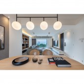
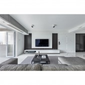
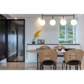
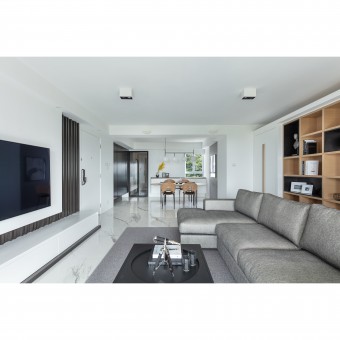
| DESIGN NAME: Grande Interior Design Team PRIMARY FUNCTION: Natural in Living INSPIRATION: The project is located in Braemar Hill with airy mountain views. By considering the nature and characteristics of the environment, the designer uses gray as the keynote and most of the materials are selected from wood and stone to match with surrounding simple harmony. UNIQUE PROPERTIES / PROJECT DESCRIPTION: Most of the materials are selected from wood and stone in the living area. The space behind the sofa is decorated with dark gray and natural veneer storage wall in order to give out contrast to the scenery. Regarding the inappropriate proportion, a series of displaying storage wall connecting with two hidden doors are thus built to make the proportion more reasonable. A wooden table and the stone bricks wall also give prominence to natural and reflecting the scenery of the apartment. OPERATION / FLOW / INTERACTION: In regards to the client's request, space would be used frequently to accommodate gatherings with friends. The designer exclusively reserved space for Corian bar tables with matching colors and bar chairs allowing for a connected space between the kitchen and dining areas. In the living area, the designer used a few pieces in wood materials. Wood colors play an important role in defining the home’s principal objective to balance the deep grey and black colors. The deep grey and black colors stand out in small proportions before the huge white walls and the warm wood tones form part of the furniture ambiance and finishes. Also, the separate dining area is occupied by a central round wooden table. This piece is specifically highlighted by the large lamp in a metal finish for distinguishing the space between dining and living areas. Otherwise, Since the children are not usually staying in this apartment, it has shaped simplified structures on the walls, ceiling, and closets. The theme of grey and wood colors is consistent with the living area and bedroom. PROJECT DURATION AND LOCATION: The project was finished in February 2019 in Hong Kong. FITS BEST INTO CATEGORY: Interior Space and Exhibition Design |
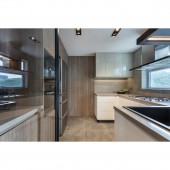
PRODUCTION / REALIZATION TECHNOLOGY: The designer focused on maintaining the design integrity of this apartment from the seventies while introducing a sensation of spaciousness and clarity. The changes made modified the home’s interior layout. In regards to the renovation, the designer created a natural lit open view out of the windows and transformed the large door opening with glass materials between the roof floor area and living area. The result is a larger and more expansive functional space, and the large glass openings bring in more natural and vibrant ambiance. Materials used in the living area are logwood and natural stone and used a few pieces in wood materials. Wood colors play an important role in defining the home’s principal objective to balance the deep grey and black colors. The deep grey and black colors stand out in small proportions before the huge white walls and the warm wood tones form part of the furniture ambiance and finishes. The designer resorted to the juxtaposition of styles for building in the bookshelf with different materials and offset layers of unity.In terms of functionality, space creates room for decorations and family photos but at the same nurtures a homely feeling for this family. SPECIFICATIONS / TECHNICAL PROPERTIES: This is over 40 years flat with net size 1,105 sq.ft TAGS: Interior Design, Residence, simplicity, Logwood, natural stone, folding door RESEARCH ABSTRACT: The folded slabs with wooden material can stretch the spatial feelings of the living room with wide visual effect. This kind of spatial strategy with different material can create a kind of transition area in private spaces. Furthermore, the iron-gray sofa can match with the white wall and the wooden slabs, which is the demonstration of a considerate colors scheme for spatial balance. This is the most elaborate part of this project which can demonstrate the designer's professional ability and experiences. CHALLENGE: According to airy mountain views, Designer mainly focused on the color scheme of the project is relatively simple. To avoid to make space looks boring, the earth tone colors from natural to deep brown were used and presented in the rich variety of materials, such as the veneer and the marble feature wall, together with the glass panels and fences which make the apartment warmer and brighter. Furthermore, in the kitchen area, the steel framed feature panel and the door both applied the material use of glass, coordinated with the large windows surrounded the house created a sense of translucency. The designer face another challenge is the building was built over 40 years. When the restoration was in processing, importantly focused on the plumbing and electrical engineering in building service. ADDED DATE: 2019-02-25 07:34:01 TEAM MEMBERS (1) : Matthew Li IMAGE CREDITS: Grande Development Limited PATENTS/COPYRIGHTS: Copyrights belong to Matthew Li, Grande Development Limited, 2019 |
||||
| Visit the following page to learn more: http://www.grandehome.com.hk/projectdeta |
|||||
| AWARD DETAILS | |
 |
Grande Interior Design Team Natural in Living by Matthew Li is Runner-up for A' Design Award in Interior Space and Exhibition Design Category, 2018 - 2019.· Press Members: Login or Register to request an exclusive interview with Matthew Li. · Click here to register inorder to view the profile and other works by Matthew Li. |
| SOCIAL |
| + Add to Likes / Favorites | Send to My Email | Comment | Testimonials |

