Saks Books Book Design by Yuta Takahashi |
Home > Winners > #78303 |
 |
|
||||
| DESIGN DETAILS | |||||
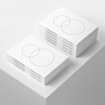
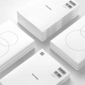
| DESIGN NAME: Saks Books PRIMARY FUNCTION: Book Design INSPIRATION: Bookstores are lined up with books of various colors, shapes, and sizes. These attributes reflect each book's character, but when seen as a whole the sizes appear inconsistent and the design lacking unity. We sought a design that would blend with the home interior when lined up on the reader's bookshelf, and kept design elements to a minimum in order to create a design that would not interfere with the reader's visual perception, expect for the necessary information. UNIQUE PROPERTIES / PROJECT DESCRIPTION: This book gives readers a new perspective by discussing the relationship between the individual and society in the modern age in analogy with that of the society and university. The book is designed to blend with the home interior when lined on the reader's bookshelf. It has a pure white appearance to evoke a rational feeling suitable for a research book. The motif of two overlapping circles is a simple expression of the theme of the relationship between the individual and society. OPERATION / FLOW / INTERACTION: The pure white appearance of the book evokes a rational attitude in readers and gives an impression that is appropriate for a research book. The book's format is maintained in all books published from Saks-Books and published as a series. We have added an interior flap that is longer than usual so that it can also be used as a bookmark. A special QR code on the back cover allows readers to easily access e-books on their digital devices. PROJECT DURATION AND LOCATION: The project was started in Japan in May 2015, completed in August 2016, and announced in September 2016. FITS BEST INTO CATEGORY: Graphics, Illustration and Visual Communication Design |
PRODUCTION / REALIZATION TECHNOLOGY: Readers are expected to read into this book many times. The cover is coated with matte polypropylene so that even if it is stained, or for example the reader spills coffee, the stain can be wiped off. The book paper uses reconstruction assistance products made in areas affected by the Great East Japan Earthquake in 2011. The paper is suitable for book paper as it is soft to the touch and has a high degree of whiteness, and it also helps the economies of areas affected by disaster. SPECIFICATIONS / TECHNICAL PROPERTIES: Flapped Paperback, 210mm x 148mm x 15mm, 176page, Mat polypropylene coating TAGS: book, bookdesign, minimal, minimalism, white, whiteandblack, typography, editorial, japan RESEARCH ABSTRACT: We searched for a common design element at the core of all books, not to dress the book up, but to simply express its essence. We wanted the book to blend with the atmosphere of study rooms, so that it does not interfere with the visual perception of readers when they are not reading, but also allow them to pick up the book quickly. We made it easy to recognize that it is a research book, found a balance with artistic qualities, and sought a sense of uniformity when lined on the bookshelf. CHALLENGE: The proposal to leave out the title on the book cover was risky. However, we thought that separating the illustration and title on the cover and spine would create a true sense of simplicity and help readers recognize the book intuitively. Ultimately, the format was a success and later turned into a series. We printed a QR code to connect the book with e-books, and aimed for a modern book design that would be positioned in between digital and analog. ADDED DATE: 2019-02-23 13:35:17 TEAM MEMBERS (1) : IMAGE CREDITS: Image 1: Photographer Yuta Takahashi, 2017 Optional Image 1: Photographer Yuta Takahashi, 2017 Optional Image 2: Photographer Yuta Takahashi, 2017 Optional Image 3: Photographer Yuta Takahashi, 2017 Optional Image 4: Photographer Yuta Takahashi, 2017 |
||||
| Visit the following page to learn more: http://yutatakahashi.jp | |||||
| AWARD DETAILS | |
 |
Saks Books Book Design by Yuta Takahashi is Winner in Print and Published Media Design Category, 2018 - 2019.· Read the interview with designer Yuta Takahashi for design Saks Books here.· Press Members: Login or Register to request an exclusive interview with Yuta Takahashi. · Click here to register inorder to view the profile and other works by Yuta Takahashi. |
| SOCIAL |
| + Add to Likes / Favorites | Send to My Email | Comment | Testimonials | View Press-Release | Press Kit |
Did you like Yuta Takahashi's Print Design?
You will most likely enjoy other award winning print design as well.
Click here to view more Award Winning Print Design.


