DESIGN NAME:
Tranquil Mind Brings Success
PRIMARY FUNCTION:
Residential House
INSPIRATION:
The design concept tends more towards reduction design, where besides satisfying living functions and needs, large dimensional and large areas are applied to demonstrate quality spatial sentiment.
UNIQUE PROPERTIES / PROJECT DESCRIPTION:
This is a residential space planning design project, the owners wanted to create a space where children may exercise freely, hence other than the necessary furniture, the interior space is simplified as much as possible.
OPERATION / FLOW / INTERACTION:
The sufficient storage and study, as well as the planning of seniors’ room also fit closely to the living demands; the designer adopted a simple and dignified style to create a refreshingly colored and sufficiently functionalized residence for the family.
PROJECT DURATION AND LOCATION:
The project finished in Hsinchu County, Taiwan.
FITS BEST INTO CATEGORY:
Interior Space and Exhibition Design
|
PRODUCTION / REALIZATION TECHNOLOGY:
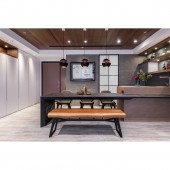
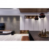
The main public area is based on warm pale colored wood texture with grey color tone lead by the architectural concrete; the raw wood dining table lying across the front area is integrated to the kitchen counter to demonstrate sense of layers, jointly forming a tranquil atmosphere with the dark colored ceiling, presenting primitive quality with the fusion of multiple materials, while the simplified lighting adds a fine sentiment to the dining room.
SPECIFICATIONS / TECHNICAL PROPERTIES:
The space is 180 square meters
TAGS:
Interior Design, Residential ,House,Space
RESEARCH ABSTRACT:
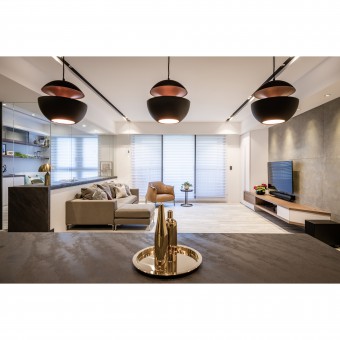
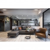
The proprietor emphasizes more on the constructional materials and the exquisiteness of the skills rather than the sophisticated details, the living room extends the architectural concrete to the television wall, leaving the center with spacious area. The rear area is organized with a study partitioned by the glass, besides keeping the visual transparency while also capable of blocking off noises; the façade applied laminated boards for the design layout, which ingeniously corresponds to the kitchen façade. This space also features the functions of the guest room and maid’s room.
CHALLENGE:
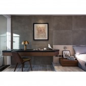
An axial symmetric arrangement is adopted for space, allowing for clear main circulation. The public space after entering the foyer can be seen clearly with one glance, where the storage wall enriched in height difference guides the spatial axis. Since the house owner prefers to collect paintings, a massive amount of architectural concrete is kept for the internal wall surfaces to allow the paintings to become the visual highlights.
ADDED DATE:
2019-02-22 09:29:09
TEAM MEMBERS (1) :
CHAO WEN-SHANG
IMAGE CREDITS:
Wen-Hsiang Chao, 2018.
|
