Oka Eye Exhibition stand by Marek Maciuba |
Home > Winners > #77872 |
 |
|
||||
| DESIGN DETAILS | |||||
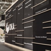
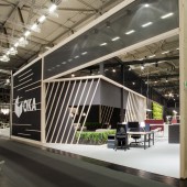
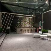
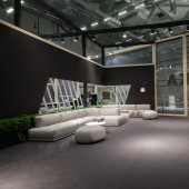
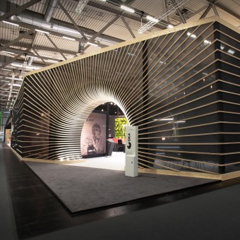
| DESIGN NAME: Oka Eye PRIMARY FUNCTION: Exhibition stand INSPIRATION: The inspiration came from the experience that we call "flash of genius" which occurs in the design process of the people engaged in developing new creative concepts. We tried to find a visually strong metaphor for a glimmer of genius in the design process that feels like acceleration in bright minds of designers which lead to excellence in design. As a result, we presented our client's products with the added value of the creative process. UNIQUE PROPERTIES / PROJECT DESCRIPTION: Form and structure of the stand illustrate the creative work process of the company. The basis is a semi-transparent facade, which is supported by wooden slats. These elements, labelled with expressive key values, continuously become more concentrated and converge at the centre of the stand, where they appear to be sucked into the semi-circular entrance area and lead to the destination. Just as the design process leads from the initial idea to a finished piece of furniture that can be found inside the stand. OPERATION / FLOW / INTERACTION: The stand interacts with the visitors by encouraging to step inside through the eye entrance and discover the world of Oka furniture. The transparent facade is a playground of the key claims which shape the performance of the design-driven company, behind which visitors can find the pieces of the furniture. Hiding the actual furniture behind the transparent facade trigged bigger attention of visitors to step inside the stand and discover the products. Inside the stand was divided into 5 zones: 1. Open space where most of the furniture was displayed showing a different configuration of workspaces. 2. A special exhibition of the OKA Europe collection enclosed in the frame box on the raised platform. 3. Chillout zone where more relaxed conversation were held. 4. Closed conference room showing the most prestigious design for top managers 5. VR room showing taking the visitors to virtually designed spaces with Oka furniture. PROJECT DURATION AND LOCATION: ORGATEC fairs 25-29.10.2016 COLOGNE, GERMANY FITS BEST INTO CATEGORY: Interior Space and Exhibition Design |
PRODUCTION / REALIZATION TECHNOLOGY: The stand concept is based on half transparent facade created with printed mesh. The idea was to show the process of creation and design thinking attitude of the Oka company. Wooden laths and text concepts randomly spread on the facade represent the creative state of mind of people who work at Oka. These elements condensate and become denser until they reach entrance where they are sucked inside. The entrance is a metaphor of the most important moment in the creative process where all the ideas are sparked and accelerated by the glimmer of genius and give result in the brilliant design of Oka furniture that can be found inside the stand. SPECIFICATIONS / TECHNICAL PROPERTIES: 15 x 27m stand area 430m2 TAGS: unique, exhibition, stand, design, oka, eye, hollow RESEARCH ABSTRACT: Our client was aware that his customers are familiar with his products and he challenged us to design a "new perspective" in which the products will be admired. Our client was also aware that in the field of office furniture design his position is strong but rather conservative and his offer is up to date but not foreseeing the future of office furniture design. The client also told us that Orgatec fairs are so big and there are so many exhibitors that the visitors rush through the stand in hope of seeing newly designed furniture pieces. If they are not amused they spend very little on the stand and go further. In the scope of the above assumptions, we came with a proposal to show not the future of office furniture design but to reveal the process of creation that lead our client to the point where he is now. We wanted to show everything that happened before the actual piece of furniture was made and to approach the design process in the new perspective. Our answer to this challenge was to design rather closed stand but with half transparent facade and to raise the curiosity of the visitors of what is hidden inside. The transparent mesh on the facade gave the opportunity to see what is happening in the designer's minds and preview the effects of their work. We also wanted the design some kind of wow effect that would not make the visitors pass the stand without going inside. The entrance in the shape of a sucked hollow did the excellent job and visitors could not omit the stand. CHALLENGE: The challenge was to show the product of our client from the perspective of the design process. We wanted to show the process that leads to the creation of the piece of furniture. We wanted to show a glimpse of how the creative mind works and comes up with clever and visually attractive ideas in the form of furniture which were displayed inside the stand. Our response was to build a rather closed stand with a half-transparent facade the represented creative mind that hides bright ideas inside. On the facade, we wanted to show the struggle of thoughts, ideas, inspiration, trends etc. that are joggled in the designer's mind. These elements are getting filtered and aligned in the design process. At some point, the creator has an intuitive but still foggy idea that with the help of great mind gets a flash of genius that results in great furniture design that can be found inside the stand. This very special moment of capturing the idea is reflected in the entrance Oka eye, where all the elements are sucked by the design force like if there was some kind of curvature of space. ADDED DATE: 2019-02-21 14:24:42 TEAM MEMBERS (2) : Marek Maciuba and Marta Poszwa IMAGE CREDITS: Maciej Szarejko PATENTS/COPYRIGHTS: Copyrights: Moa Masters of Arts sp. z o.o. |
||||
| Visit the following page to learn more: http://www.moa.pl | |||||
| AWARD DETAILS | |
 |
Oka Eye Exhibition Stand by Marek MacIuba is Winner in Interior Space and Exhibition Design Category, 2018 - 2019.· Press Members: Login or Register to request an exclusive interview with Marek Maciuba. · Click here to register inorder to view the profile and other works by Marek Maciuba. |
| SOCIAL |
| + Add to Likes / Favorites | Send to My Email | Comment | Testimonials | View Press-Release | Press Kit |

