DESIGN NAME:
Cloud End
PRIMARY FUNCTION:
Sales Center
INSPIRATION:
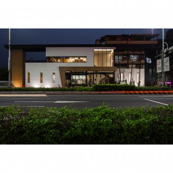
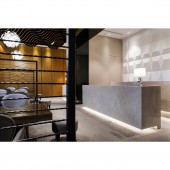
This is a commercial space project for a constructor’s sales reception center, with the lobby reception counter, the prototype display area and the client discussion area planned for the ground floor, while the reception space with more privacy is planned for the second floor.
UNIQUE PROPERTIES / PROJECT DESCRIPTION:
The original shape of this base was triangular, and the overall proportion is widened for the aesthetical design, while creativity is demonstrated through the asymmetrical forms within the symmetry of the building volume, the large French window also becomes the ideal display window, attracting the passing by crowd to take a break here.
OPERATION / FLOW / INTERACTION:
Demonstrating perspective towards spatial planning when thinking about the nature of the space as well as the usage functions, further allowing the odd shaped land with the illusion of enlarged space.
PROJECT DURATION AND LOCATION:
The project finished in Dec. 2016 in New Taipei City, Taiwan.
FITS BEST INTO CATEGORY:
Interior Space and Exhibition Design
|
PRODUCTION / REALIZATION TECHNOLOGY:
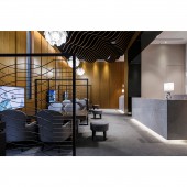
The massive amount of wooden wavy ceiling in the ground floor space represents the vast sea of clouds, where the dynamic posture demonstrates the rhythm within the space, while the aesthetical wood patterns applied calcium silicate dye instead of veneer, yet it is capable of becoming one with the surrounding pale colored veneer, thereby demonstrating the wood pattern texture in the second dimension within the third dimension.
SPECIFICATIONS / TECHNICAL PROPERTIES:
The space is 294 square meters
TAGS:
Interior Design,Commercial Space,Public,Sales Center
RESEARCH ABSTRACT:
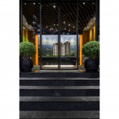
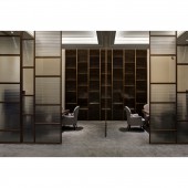
Planned on the right side of the space is the staircase, forming the unique shape of the French window internal view via the wall design and the staircase. Follow the circulation to go up towards the discussion area on the second floor, which adopted spatial partitioning, using matt sliding doors to accomplish uninterrupted discussions, as taking control over the entire atmosphere is one main key point to successful sales business. The proprietor also hopes that the clients may discover the constructor’s control over the space, as well as the effort put into the details and techniques upon entering this space, thereby enhancing the clients’ knowledge towards the product. The internal space used wooden surfaces and display cabinets to demonstrate the Japanese style differing to the ground floor, subverting the rugged texture of spaces with temporary usage to demonstrate the elegant and exquisite quality with the use of soft and indirect light source.
CHALLENGE:
The overall area included non-chromatic grey tone complemented by pale wooden color to create the tranquil atmosphere in the venue. The front part at the entrance is the prototype display area, the reception counter with the discussion area on the right, where the space is separated by the use of material implications.
ADDED DATE:
2019-02-20 09:17:01
TEAM MEMBERS (2) :
CHEN,JIA-RU and LUO, JOSH
IMAGE CREDITS:
Jia-Ru Chen, 2018.
|
