Long Live Brunello Corporate Identity by Cristian Carrara |
Home > Winners > #77488 |
 |
|
||||
| DESIGN DETAILS | |||||
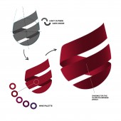
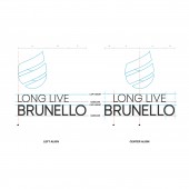
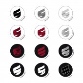
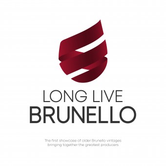
| DESIGN NAME: Long Live Brunello PRIMARY FUNCTION: Corporate Identity INSPIRATION: The design of the logo was inspired by the movement made by the sommeliers to shake the glass of wine to catch its smells and aromas. After an analysis of the different logos present in the world of wine, the glass and the ruby red color of Brunello wine was chosen as the most evocative of the event in a fresh and captivating design due to the international nature of the event. UNIQUE PROPERTIES / PROJECT DESCRIPTION: The logo was designed for an important event on aged Brunello wine in Montalcino, Italy. The identity of the brand had to evoke excellence in addition to the world of wine and a reference to a long aging process, hence the idea of developing a logo that recalled a glass of red wine in the act of shaking it to catch its scent. The wine is represented by two red ribbons coupled in a spiral that rises upwards to evoke the time spent in aging towards the excellence of a vintage Brunello wine. OPERATION / FLOW / INTERACTION: The logo has been developed to be used and reproduced in different variants for every communication need. It can be used both with the writing in its extended form, or as an icon for apps or social networks. An in-depth study led to the definition of variations for use on different background colors, including red. PROJECT DURATION AND LOCATION: The project started in January 2019 in Bergamo and finished in February 2019 in Montalcino with an official presentation during the Benvenuto Brunello 2019. FITS BEST INTO CATEGORY: Graphics, Illustration and Visual Communication Design |
PRODUCTION / REALIZATION TECHNOLOGY: The logo was created using computer graphics after a hand-drawing study necessary to identify the exact curvature and shape of a glass of red wine. SPECIFICATIONS / TECHNICAL PROPERTIES: The design has been designed to be able to adapt to any size of print while maintaining the recognizable logo. The drawing is vector. The colors have been calculated for an identical yield for both the print and the web with the different variations (shade or flat). TAGS: Logotype, Corporate Identity, Logo Design, Visual Design, Graphic Design, Logo, Brunello, Illustrator RESEARCH ABSTRACT: An in-depth research was carried out to study the elements and colours necessary for recognising an event about wine, finding the right means to communicate the focus in a glass of wine. Further research was carried out to find out if there were other logos in the world that could have the same conformation and characteristics in order to create a unique and original logo. The sketch of the logo has been submitted to experts, amateurs of the wine and operators in the field of visual communication before being drafted the final project in order to know better what would have communicated. CHALLENGE: The challenge in designing a logo for an event on wine consists in finding an image that is unique and unedited because of the many existing logos and the specificity of the subject that requires specific colours that must evoke the essential nature of the product, the wine. Even the nature of the event, not unique but very sectorial with an international appeal, involved a specific research in the context of events reserved for aged wine, events aimed at a specific and high level audience. For these reasons the logo had to evoke the wine but also its peculiarity of being a prized wine. ADDED DATE: 2019-02-19 10:06:24 TEAM MEMBERS (1) : IMAGE CREDITS: Image #1: Cristian Carrara, Long Live Brunello Corporate Identity, 2019. Image #2: Cristian Carrara, Phases of study and construction of the logo, 2019. Image #3: Cristian Carrara, Colours study, 2019. Image #4: Cristian Carrara, Typeface, 2019. Image #5: Cristian Carrara, Logo variations, 2019 PATENTS/COPYRIGHTS: Copyrights belong to Winocracy, 2019. |
||||
| Visit the following page to learn more: http://bit.ly/2NfBjOj | |||||
| AWARD DETAILS | |
 |
Long Live Brunello Corporate Identity by Cristian Carrara is Winner in Graphics, Illustration and Visual Communication Design Category, 2018 - 2019.· Read the interview with designer Cristian Carrara for design Long Live Brunello here.· Press Members: Login or Register to request an exclusive interview with Cristian Carrara. · Click here to register inorder to view the profile and other works by Cristian Carrara. |
| SOCIAL |
| + Add to Likes / Favorites | Send to My Email | Comment | Testimonials | View Press-Release | Press Kit |
Did you like Cristian Carrara's Graphic Design?
You will most likely enjoy other award winning graphic design as well.
Click here to view more Award Winning Graphic Design.


