Ichifuku Logomark by Hino Naoya |
Home > Winners > #77174 |
 |
|
||||
| DESIGN DETAILS | |||||
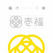
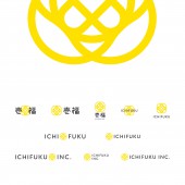
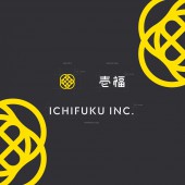
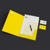
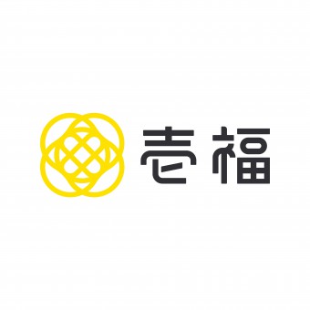
| DESIGN NAME: Ichifuku PRIMARY FUNCTION: Logomark INSPIRATION: The business is composed of individuals' ideas and their direction are not stuck to one. To express its diversity of company, ring shaped parts lie one upon another. UNIQUE PROPERTIES / PROJECT DESCRIPTION: Visual identity and branding for Ichifuku, multiple business company in Japan. The mark is made with a part of Kanji "Fuku" which means "happy" in Japanese. OPERATION / FLOW / INTERACTION: The logo has high readability and rememberability becasue of its simple form and clean isolations of elements. PROJECT DURATION AND LOCATION: The project start in January 2018 in Chiba japan and finished in April 2018. FITS BEST INTO CATEGORY: Graphics, Illustration and Visual Communication Design |
PRODUCTION / REALIZATION TECHNOLOGY: Typography of logo consists of same size curves. SPECIFICATIONS / TECHNICAL PROPERTIES: The balance of logomark and typograpgy is designed with the same size circle elements of them. TAGS: Logo, Logo Design, Visual Itentity, Graphic design, Branding, Japan, Yellow RESEARCH ABSTRACT: - CHALLENGE: - ADDED DATE: 2019-02-18 00:30:36 TEAM MEMBERS (1) : IMAGE CREDITS: Image #1: Designer Hino Naoya, Ichifuku, 2018 Image #2: Designer Hino Naoya, Ichifuku, 2018 Image #3: Designer Hino Naoya, Ichifuku, 2018 Image #4: Designer Hino Naoya, Ichifuku, 2018 Image #5: Designer Hino Naoya, Ichifuku, 2018 PATENTS/COPYRIGHTS: Copyrights belong to Ichifuku, 2018 |
||||
| Visit the following page to learn more: https://www.428.co.jp/work/ichifuku/ | |||||
| AWARD DETAILS | |
 |
Ichifuku Logomark by Hino Naoya is Winner in Graphics, Illustration and Visual Communication Design Category, 2018 - 2019.· Press Members: Login or Register to request an exclusive interview with Hino Naoya. · Click here to register inorder to view the profile and other works by Hino Naoya. |
| SOCIAL |
| + Add to Likes / Favorites | Send to My Email | Comment | Testimonials | View Press-Release | Press Kit |

