DESIGN NAME:
Korypho Villas
PRIMARY FUNCTION:
Corporate Identity
INSPIRATION:
The logo is a combination of a shield (reminiscent of the Italian heritage) and a clay pot (making a direct association with Corfian traditions).
Expanding the idea of the logo as a container, a series of illustrations were developed to create variety and communicate, in an abstract way, the rich experience that the owners of the Villas are hoping their guests will enjoy.
UNIQUE PROPERTIES / PROJECT DESCRIPTION:
Naming and Identity for a set of luxury villas, located in a very particular place of the world; The Island of Corfu. Corfu has a long history of Italian occupation which is evident throughout the island's architecture and traditions. The island is also world-renowned for its Easter tradition, rooted deep into the past, of breaking clay pots. The final solution takes its inspiration from the rich history of the island and highlights the core values of the company in an elegant and modern manner.
OPERATION / FLOW / INTERACTION:
Most of the materials are designed to be used by the visitors within the premises. Their aim is to enhance the experience of the user and to showcase the attention to detail and care that the owners take to provide an excellent experience.
PROJECT DURATION AND LOCATION:
The project started in February 2018 and finished by December 2018, including production.
FITS BEST INTO CATEGORY:
Graphics, Illustration and Visual Communication Design
|
PRODUCTION / REALIZATION TECHNOLOGY:
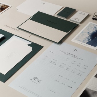
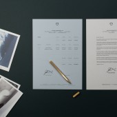
The bespoke collateral, use a range of printing techniques, such as foil and blind embossing, to further emphasise the attention to detail and care that goes into each aspect of the visitors experience.
SPECIFICATIONS / TECHNICAL PROPERTIES:
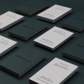
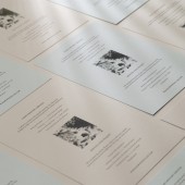
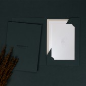
A range of collateral was produced for different needs of the business: From envelopes and business cards all the way to presentation folders and with compliments cards.
TAGS:
Brand Identity, Logo, Corporate Identity, Stationary
RESEARCH ABSTRACT:
Research for this project played a key role in informing the final design approach. It was conducted mainly online and by visiting the island. The main focus of the research was to understand the key elements that differentiate Corfu from others, both in Greece and the rest of the world.
The research revealed the deep influences that Italian occupation had on the island, which in turn informed every design decision, from the colour palette all the way to the typefaces and art direction.
CHALLENGE:
The main challenge was to effectively position this new business on a market that is very competitive and in a way that differentiates it from the competition. Further challenges included producing a final result that would communicate a luxury offering in a very cost-effective manner.
ADDED DATE:
2019-02-16 11:54:57
TEAM MEMBERS (1) :
IMAGE CREDITS:
Image #1: Photographer Lunch Press
Image #2: Photographer Yorgos Panagopoulos
Image #3: Photographer Yorgos Panagopoulos
Image #4: Photographer Yorgos Panagopoulos
Image #5: Photographer Yorgos Panagopoulos
|
