Peppers and Circumstance Sauce by Christia Cheuk-Ying Fung |
Home > Winners > #76827 |
 |
|
||||
| DESIGN DETAILS | |||||
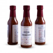
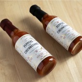
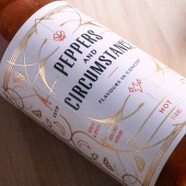
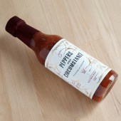
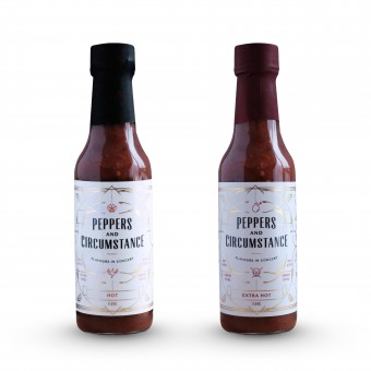
| DESIGN NAME: Peppers and Circumstance PRIMARY FUNCTION: Sauce INSPIRATION: Peppers and Circumstance was inspired by the classical song, Pomp and Circumstance, a song of triumph over the war. The complex flavors of the sauce mimics the different tones of the different marches, and a sense of triumph comes from defeating the heat of the sauce. Hence, the slogan, "Flavours in Concert". UNIQUE PROPERTIES / PROJECT DESCRIPTION: For Peppers and Circumstance, we wanted to keep it classy to reflect the roots of the inspiration, while giving it some edge, since it is a spicy hot sauce at the end of the day. The overall tone of the packaging is to reflect the little nuances of the song by making it flow with little quirks and surprises in the design to also display the different levels of spice between the 2 sauces. OPERATION / FLOW / INTERACTION: The use of gold foil gives the bottle a elegance and a timeless look to it. This is accentuated by the symmetrical frame that draws the user's eyes towards the iconography as well as the main pepper ingredients. The icons act as a warning of how hot the sauce is and that is supported by the peppers used within the sauce. PROJECT DURATION AND LOCATION: Project started in October 2018 and finished in November 2018. Made and sold in Canada FITS BEST INTO CATEGORY: Packaging Design |
PRODUCTION / REALIZATION TECHNOLOGY: The design injected the movement of the playful song, by incorporating a lot of circular forms that portray the different tones of the original song; as if the flavours are dancing in your mouth once consumed. Icons display the level of spiciness the sauce delivers as a warning to the heat that is expected. A system was developed where the icons and pepper types would change for future flavours, keeping a consistent look for the sauce lineup. SPECIFICATIONS / TECHNICAL PROPERTIES: 150ml bottle of hot sauce TAGS: classical, minimal, hot sauce, packaging, modern, spicy, art deco, timeless, icons, iconography RESEARCH ABSTRACT: The hot sauce was inspired by the song, Pomp and Circumstance because the song represented triumph and celebration. It was based off that particular song because the flavours in the sauce is complex, while still delivering the heat. When the user eats the sauce, there is a sense of triumph when they are able to beat the heat and continue eating it. Hence the name, "Peppers and Circumstance" is born. As for the slogan, "Flavours in Concert", it is used to represent the garlic flavours within the sauce, noting that it is not just a flat hot sauce, but a complex one in terms of flavours. CHALLENGE: Having a design that does justice to the iconic song was the main challenge, since the song has many different marches within it. To give the design movement and flow to represent the song, circular forms were used to draw the eye towards the icons and the main peppers that were used in the sauce itself. The circular forms also give the design some playfulness, while keeping it clean and modern. ADDED DATE: 2019-02-16 01:01:27 TEAM MEMBERS (3) : Art Director: Christia Fung, Designer: Christia Fung and Photographer: Christia Fung IMAGE CREDITS: Photographer: Christia Fung |
||||
| Visit the following page to learn more: http://christiafung.com/ | |||||
| AWARD DETAILS | |
 |
Peppers and Circumstance Sauce by Christia Cheuk-Ying Fung is Winner in Packaging Design Category, 2018 - 2019.· Press Members: Login or Register to request an exclusive interview with Christia Cheuk-Ying Fung. · Click here to register inorder to view the profile and other works by Christia Cheuk-Ying Fung. |
| SOCIAL |
| + Add to Likes / Favorites | Send to My Email | Comment | Testimonials | View Press-Release | Press Kit |

