Math Workbook Gae-yu Math Workbook by Jaehun Kim and Sanghyun An |
Home > Winners > #76682 |
 |
|
||||
| DESIGN DETAILS | |||||
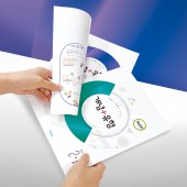
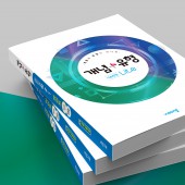
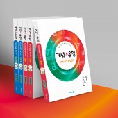
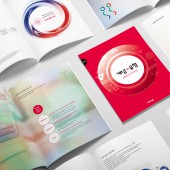
| DESIGN NAME: Math Workbook Gae-yu PRIMARY FUNCTION: Math Workbook INSPIRATION: Using circles, the most stable shape among figures in mathematics that holds the meaning of completeness, an intuitive design with impact was created. A mysterious color texture was added inside the circle to express the brand essence of Gae-yu, 'synergy up'. Covers of math concept and drills each were designed with semicircles with different colors and directions, so they can created a completed circle with a unique color combination when combined as a set. UNIQUE PROPERTIES / PROJECT DESCRIPTION: Gae-yu consists of two books as a set, allowing students to study the concepts and drills of mathematics organically and conveniently in effective ways. Drills, classified into Lite, Power and Top levels based on the level of difficulty, is modularized with Concept that leaners can use it according to their level. In order for the learners to acknowledge and utilize such usability easily, the cover image was structured. OPERATION / FLOW / INTERACTION: The most common way to learn mathematics is to understand the concept of mathematics and to solve various exercises related to it. This book was developed optimally for these math learning methods. In the distribution process, it appears as one book, but when you use the book, you can spread between the two books and lightly press it with your hand to easily separate the two books from the cover. Separate books are easy to organically learn math concepts and drills, and are well-received by users. PROJECT DURATION AND LOCATION: The project started in March 2018 and was completed in October 2018. / Republic of Korea. Seoul FITS BEST INTO CATEGORY: Graphics, Illustration and Visual Communication Design |
PRODUCTION / REALIZATION TECHNOLOGY: Gae-yu were bound using temporary adhesive, so they can be easily separated from the outer cover, but conveniently handled during the distribution process without the concern for loss. It also improves the convenience for consumers that purchase the book. In accordance with the development intention of this book that suggests an effective learning method in a short period of time, the two books can be separated and opened side by side, and either one can be separated and carried along according to the need. It was designed to let students study using two books at a reasonable price. Printed on an art paper with matte coating, a glittering transparent hologram was placed over to emphasize the design with the mysterious look that comes from the difference in textures. SPECIFICATIONS / TECHNICAL PROPERTIES: Width 215mm x Depth 12mm x Height 285mm / Weight 0.16kg / paper material : Art paper 250g TAGS: Cover design, Math workbook RESEARCH ABSTRACT: Visang, an educational publishing company that have been developing innovative educational contents for better learning, published a mathematics workbook, Gae-yu, in 2002. The Gae-yu of mathematics were combined math concepts and drills into one book for convenience and efficiency. that were never seen before, so students can learn the most effectively in a short period of time Preferred continuously for the effect of organic learning between math concept and drills, Gae-yu is being sold for over 400,000 copies per year, and is Korea's top mathematics workbook that reached accumulated sales of 25 million copies since the publication. CHALLENGE: Celebrating its 20th anniversary in 2018, Visang produced the first brand book as an educational publication brand in Korea. It consisted of meaningful processes to gather scattered materials for brand identity and continued management of brand, and tried to develop workbook designs that embrace brand essence. Gae-yu had to combine functionality and beauty at the same time, so the design had to be simple and intuitive. To develop such design, many drafts were developed, and there had been many trials and errors to find the design that visualized the convenience most intuitively through consumer survey. After 8 months of hard work, the design that embraces the features of Gae-yu through separation and combination of circular graphic motif was developed. ADDED DATE: 2019-02-15 09:44:13 TEAM MEMBERS (5) : Designer: Taeeun Lee, Designer: Seonmi Seo, Designer: Taewoo Park, Designer: Jin Kim and Creative Director: Sanghyun An IMAGE CREDITS: Visang Gae-yu Cover Image #1, Visang Gae-yu Cover Image #2, Visang Gae-yu Cover Image #3,Visang Gae-yu Cover Image #4, Visang Gae-yu Cover Image #5 |
||||
| Visit the following page to learn more: http://book.visang.com/ | |||||
| AWARD DETAILS | |
 |
Math Workbook Gae-Yu Math Workbook by Jaehun Kim and Sanghyun An is Winner in Graphics, Illustration and Visual Communication Design Category, 2018 - 2019.· Read the interview with designer Jaehun Kim and Sanghyun An for design Math Workbook Gae-yu here.· Press Members: Login or Register to request an exclusive interview with Jaehun Kim and Sanghyun An. · Click here to register inorder to view the profile and other works by Jaehun Kim and Sanghyun An. |
| SOCIAL |
| + Add to Likes / Favorites | Send to My Email | Comment | Testimonials | View Press-Release | Press Kit |
Did you like Jaehun Kim and Sanghyun An's Graphic Design?
You will most likely enjoy other award winning graphic design as well.
Click here to view more Award Winning Graphic Design.


