Hello Mobile Direct Online Shop by Mihye Je and Eunkyul Lee |
Home > Winners > #76615 |
 |
|
||||
| DESIGN DETAILS | |||||
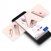
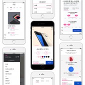
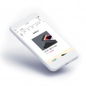
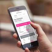
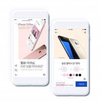
| DESIGN NAME: Hello Mobile Direct PRIMARY FUNCTION: Online Shop INSPIRATION: Hello Mobile is a website for smartphone purchases and carrier contracts. However, we had more design freedom compared to other purchase websites because of the limited number of products for sale and the main customers being young adults who can handle smartphones well. Just as one can deeply be immersed in a piece of artwork when it is presented in a large exhibition hall all by itself, we suggested an experimental design that focuses on making each smartphone and data product stand out and become centralized. UNIQUE PROPERTIES / PROJECT DESCRIPTION: It was necessary to make products stand out for an online shop. By minimizing and simplifying design, the features that divert attention were eliminated. With active exploitation of negative space, importance of each type of content was increased. Further, we used dynamic photos positively to prevent visual boredom. To imprint a clear brand image, pink, which is the identity color of the brand, was used actively as a point. Through the positive use of the identity, the image is then engraved with the use of highlighting color, it captured the gaze and action naturally of the users. OPERATION / FLOW / INTERACTION: Overall, it has a simple configuration that moves the page up/down. However, the main page has its own uniqueness to move up/down/left/right. It consists of 16 pages in total with 4 topics. Moving the page up/down allows the users to move between topics and moving left/right on the page (topic) allows the users to obtain more information on the topic. PROJECT DURATION AND LOCATION: The project started in February 2017 and the website launched in July 2017. FITS BEST INTO CATEGORY: Interface, Interaction and User Experience Design |
PRODUCTION / REALIZATION TECHNOLOGY: Adobe Photoshop, Illustrator, Invision SPECIFICATIONS / TECHNICAL PROPERTIES: It is designed for various resolutions to work with all smartphone web browsers. TAGS: Web design, Material Design, Overlapping, CJ Hello, Mobile website, UX, UI, UI design, Product design, Interface, Design, Parallex RESEARCH ABSTRACT: First, to determine the direction of design, we researched and analyzed the web design trend then extracted applicable elements. Secondly, we conducted a survey of the current design and similar designs from other companies from the employees of the client company to identify business needs and desired design style. With expert analysis, we identified the strengths and weaknesses of designs from other companies and applied this knowledge to the website. CHALLENGE: There were two difficulties in designing this website. First, because of the design concept of the main page, we had to display as much of the information as possible on a single page to allow it to be seen without scrolling down. Due to the limited screen size, we focused on adjusting strengths/weaknesses of information and its readability. Secondly, the design concept of Simple and Friendly was somewhat a conflicting theme, therefore, we expressed friendliness only in areas that are visually appropriate within Simplicity. It was difficult to balance tension to prevent shifting to one keyword. ADDED DATE: 2019-02-15 06:15:44 TEAM MEMBERS (3) : Mihye Je, Seunghyun Kang and Eunkyul Lee IMAGE CREDITS: Creator Mihye Je, 2019 PATENTS/COPYRIGHTS: Copyrights belong to CJ Hello Mobile |
||||
| Visit the following page to learn more: http://bitly.kr/phb11 | |||||
| AWARD DETAILS | |
 |
Hello Mobile Direct Online Shop by Mihye Je and Eunkyul Lee is Winner in Website and Web Design Category, 2018 - 2019.· Press Members: Login or Register to request an exclusive interview with Mihye Je and Eunkyul Lee. · Click here to register inorder to view the profile and other works by Mihye Je and Eunkyul Lee. |
| SOCIAL |
| + Add to Likes / Favorites | Send to My Email | Comment | Testimonials | View Press-Release | Press Kit |
