DESIGN NAME:
Pure Processional Views
PRIMARY FUNCTION:
Residence
INSPIRATION:
Space constructs suggestive postures through linearity, with hidden unique aesthetic views, perceived through arts and life; therefore, through time and light, amongst movement or stagnation, we experience the perennial and transience. The design team anchors its design discourse for this project on the Chinese thinking of Fengshui, as the design is of the white color tonality designated by the owner, and of spacious, casual, recreational and relaxing, as the main direction of design planning.
UNIQUE PROPERTIES / PROJECT DESCRIPTION:
Amongst the existence of linearity and surface, the patterns of natural medium of materiality and their humble nature permeate throughout the living program, as well as the deep psyche of the residents, while indirectly demarcate the space, as the transition, either through the colors of materials or decorations, a sense of lightness or sternness in shaping the reserved underlying spatial fabric of the interior.
OPERATION / FLOW / INTERACTION:
The overall design of this space places premium on the leveraging of natural light, or the arrangement of night-time illumination, a testament to the intended dialogue between the vista and the beholders, where a large amount of framed views extending the vista outwards and allowing the overall ambiance to become natural and intimate.
PROJECT DURATION AND LOCATION:
The project finished in March 2016 in Yilan City, Taiwan.
FITS BEST INTO CATEGORY:
Interior Space and Exhibition Design
|
PRODUCTION / REALIZATION TECHNOLOGY:
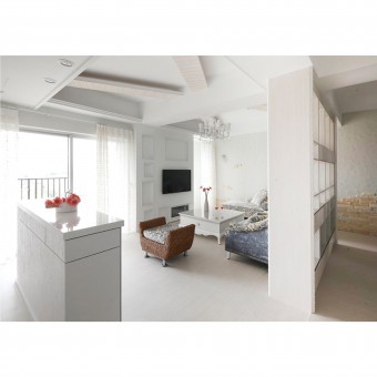
Hand-crafted light grey wall, cast stone, and ultra scratch-proof timber floor. The owner would like a pure white interior for occasional solitude or for companionship with friends. The design utilizes a bright and gentle white color to establish a natural connection within the architectural environment. The harmonious rhythmic movement amongst dots and lines, in the face of changing seasonality, subject the interior to the charm of light and shadow upon encounters.
SPECIFICATIONS / TECHNICAL PROPERTIES:
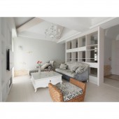
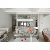
The interior area is of approximately 90 square meters. Natural lighting was drawn into the interior with transparent high-height cabinet volume to form the corridor imagery unique to Chinese architecture, so as to break away from the conventional framework so that domains replaced demarcation, all in the hope of intensifying the possibilities of extensive interweaving of domains, before inducing a sense of minimal order, serenity and pure comfort the space is supposed to be imbued with.
TAGS:
Fengshui, Natural Element, Humility, Richness, Chinese Architecture
RESEARCH ABSTRACT:
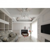
As the entrance area features the hand-crafted light grey wall and cast stone as the expression of its elevation, the main wall design with its symmetrical proportionality is extended to construct the main elevation symbolism as well as featuring a fireplace to link up the public and private domains. As the public domains were planned with transparent cabinet rack or materials, the design also allows the existing elements to complement one another in a free and meticulous fashion.
CHALLENGE:
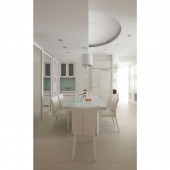
In terms of the planning of this project, apart from consideration for issues of Fengshui, the project needs to be rendered in a white color tone almost entirely, which was proved to be the major challenge. Furthermore, in terms of the circulation arrangement that adhered to Fengshui principle related to the entrance door, it also allowed the dining area to be the center of energy flow of the entire residence.
ADDED DATE:
2019-01-31 03:08:58
TEAM MEMBERS (1) :
CHANG,TZU-HSIEN
IMAGE CREDITS:
David Michael International Design Co.,LTD
|
