Quench and Blossom Office by Leo Lin - Zoom Interior Design Studio |
Home > Winners > #74988 |
 |
|
||||
| DESIGN DETAILS | |||||
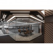
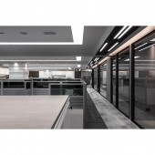
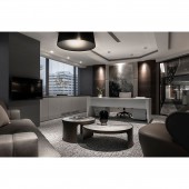
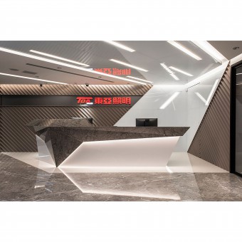
| DESIGN NAME: Quench and Blossom PRIMARY FUNCTION: Office INSPIRATION: As the client is the leading brand in the lighting industry in Taiwan, founded half-century ago, the design of the brand new interior strives to articulate the narrative of the innovation of the brand. The design team was inspired by the working intensity of the ironsmiths under the high heat environment in crafting their creations while the anvils were subject to flying spark, mimicking the competitive drive and spirit of the customer in shaping its corporate operation and brand management strategies. UNIQUE PROPERTIES / PROJECT DESCRIPTION: At the entrance counter, the design was based on the metalwork tool, Anvil, echoing with the initial, T, of the corporate logo, as the spark from metalwork was also adopted by the design team as the symbolism in the lighting design for the interior, while extending the visual focus to the world-map light-box to the left of the entrance, in depicting the vision of embracing the world stage. OPERATION / FLOW / INTERACTION: As limited by the floor-to-floor height of the building, while the reception entrance of corporate image, being the focus of this design project, reflective materials complemented with marble flooring has achieved the visual effect of enlargement and bring relief to any visual oppression. The previously scattered departments over the four floors have now been consolidated on the same floor, as the glass-wall offices of each department head are aligned with their departments in charge, so as having optimized the vertical and horizontal communication efficiency. PROJECT DURATION AND LOCATION: The project finished in May, 2018 in Taipei City, Taiwan. FITS BEST INTO CATEGORY: Interior Space and Exhibition Design |
PRODUCTION / REALIZATION TECHNOLOGY: Glass, marble, and carpet SPECIFICATIONS / TECHNICAL PROPERTIES: The design area is of 776.9 square meters. TAGS: Glass Partition, Transparency, Office Design, Brand, Marble, Diamond Cut RESEARCH ABSTRACT: The client would like to have the new space challenging the rigid conventional office layout in Taiwan, with the entrance counter design of masonry panel styling; the overall office area was imbued with linearity in structure and ample lighting, as a vivid expression of rational and rhythmic spatiality. Glass-box-like meeting rooms preserve the visual openness with privacy addressed, and furthermore, the open-plan staff working area had all office equipment and consumables consolidated with system storage to ensure working efficiency. CHALLENGE: The most considered aspect of the design was how to articulate the brand essence to be represented by the Headquarter Office. The design team strived to shape the design of the entrance reception counter as the communicative medium, in terms of materiality or cabinet volume styling, as to directly resonate with the client's corporate brand, of which the result in creative concepts and expressions was very satisfactory to the corporate client. ADDED DATE: 2019-01-29 04:06:44 TEAM MEMBERS (2) : Designer:Leo Lin and Engineer:Ring Lin IMAGE CREDITS: Photographer: Andy, 2018. |
||||
| Visit the following page to learn more: https://reurl.cc/Q5keq | |||||
| AWARD DETAILS | |
 |
Quench and Blossom Office by Leo Lin-Zoom Interior Design Studio is Winner in Interior Space and Exhibition Design Category, 2018 - 2019.· Press Members: Login or Register to request an exclusive interview with Leo Lin - Zoom Interior Design Studio. · Click here to register inorder to view the profile and other works by Leo Lin - Zoom Interior Design Studio. |
| SOCIAL |
| + Add to Likes / Favorites | Send to My Email | Comment | Testimonials | View Press-Release | Press Kit |


