Mother Root Cosmetics by Kiss Branding |
Home > Winners > #74939 |
 |
|
||||
| DESIGN DETAILS | |||||
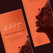
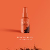
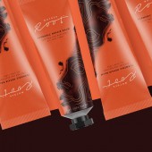
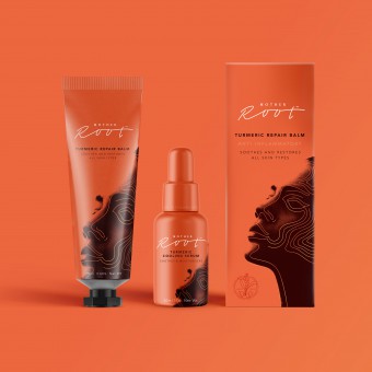
| DESIGN NAME: Mother Root PRIMARY FUNCTION: Cosmetics INSPIRATION: Turmeric is a super spice that’s been underrated and underused for years. Finally, it’s started to be recognized for its healing properties which other cultures have utilized and valued for generations. There’s far too much artificial and chemical based cosmetics and lotions out there when a natural alternative is right under our noses. We wanted to create a range that showcased the power of Turmeric and tell the story of its abilities without being typical in our approach. UNIQUE PROPERTIES / PROJECT DESCRIPTION: Mother Root is a range of creams and ointments, infused with the golden power of Turmeric. Our brand identity and packaging concept takes an indulgent approach to Turmeric based skincare. Using delicate contours wrapping around the face, the packs evoke a targeted treatment that's effective and soothing for modern audiences. In combination with raw burnt red colours, organic shapes and premium cues, the design celebrates the product's earthy and natural healing origins in an efficacious yet original way. OPERATION / FLOW / INTERACTION: Turmeric is a natural inflammatory and can be used straight onto the skin to reduce inflammation. It truly is an ancient miracle spice that has been used by people across the world for thousands of years. But the modern British public is unfamiliar with it and uncertain of what it can do and how to use it. By creating an easy to use and understandable range of products, we can put Turmeric to work and allow it to do what it does best, in a way that's familiar and trusting. PROJECT DURATION AND LOCATION: The project started in May 2018 in Leeds, UK and completed in September 2018. FITS BEST INTO CATEGORY: Packaging Design |
PRODUCTION / REALIZATION TECHNOLOGY: The packaging is made from a mixture of card boxes, aluminum tubes, and glass serum bottles. SPECIFICATIONS / TECHNICAL PROPERTIES: Tube Box: Height 185mm x Width 60mm x Depth 50mm Tube: Diameter 40mm x Height 170mm Bottle: Diameter 30mm x Height 100mm TAGS: Beauty, Brand Identity, Cosmetics, Spice, Packaging, Turmeric, Mother, Root, Earth, Natural RESEARCH ABSTRACT: While researching into the beauty and cosmetics space for another project, through trend analysis and market audits, we realized Turmeric didn't have it's own space within the market. No one was highlighting it's external benefits and it's medicinal properties, the only place you'd find Turmeric was in the food space. So we decided to hero it ourselves. We found there was clearly a demand for natural and organic alternatives to regular shop bought cosmetics so creating a brand for Mother Root was an easy decision. We gave Turmeric a bold look and appeal that would grab the attention of young modern audiences but also educate them on its healing powers. CHALLENGE: The challenge was to creatively find a balance of a combination of things. Firstly, we wanted it to be clear what the number one ingredient is, Turmeric. Secondly, to tell how the ingredient will benefit the user. Thirdly, how and where it should be used. We needed to communicate all these things while keeping the design simple, elegant and premium. Lastly, we also needed to create a point of difference, using indulgent and unexpected colours and imagery that also helped communicate its efficaciousness. Ultimately, we had a lot of boxes to tick. ADDED DATE: 2019-01-28 15:05:08 TEAM MEMBERS (3) : Designer: Poonam Saini, Director: Matt Kilb and IMAGE CREDITS: Image #1: Photographer Caique Silva Image #2: Photographer Jessica Felicio |
||||
| Visit the following page to learn more: http://www.kissbranding.co.uk/ | |||||
| AWARD DETAILS | |
 |
Mother Root Cosmetics by Kiss Branding is Winner in Packaging Design Category, 2018 - 2019.· Read the interview with designer Kiss Branding for design Mother Root here.· Press Members: Login or Register to request an exclusive interview with Kiss Branding. · Click here to register inorder to view the profile and other works by Kiss Branding. |
| SOCIAL |
| + Add to Likes / Favorites | Send to My Email | Comment | Testimonials | View Press-Release | Press Kit | Translations |
Did you like Kiss Branding's Packaging Design?
You will most likely enjoy other award winning packaging design as well.
Click here to view more Award Winning Packaging Design.


