YM Coffee Project Brand Identity by BumSeok Hong |
Home > Winners > #74883 |
 |
|
||||
| DESIGN DETAILS | |||||
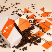
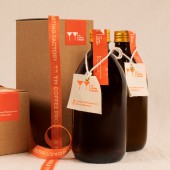
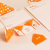
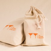
| DESIGN NAME: YM Coffee Project PRIMARY FUNCTION: Brand Identity INSPIRATION: YM Coffee Project's Brand Identity is made by overlapping alphabet YM and the shape of house, and the door is open. Opened doors mean Welcome. UNIQUE PROPERTIES / PROJECT DESCRIPTION: The identity captures the name YM and the mood of the YM Coffee Project in a mark that is welcoming, cozy and comfortable like home. Set in YM Coffee Project : YM Coffee House, YM Roasting Factory and more, the identity evokes the align of the Project, as well as taste and expertise for the perfect coffee. OPERATION / FLOW / INTERACTION: I work for YM Coffee Project for 5 months. From head to toe, I keep digging this field and finding ways to be great. I organize brand value as keywords like warm, special, professional. You can see more details via document I attached. Before visualizing, I make vague concept or ideas to the text to make it clear. And it works! PROJECT DURATION AND LOCATION: The project started in May 2018 in Seoul and finished in September 2018 in Seoul. FITS BEST INTO CATEGORY: Graphics, Illustration and Visual Communication Design |
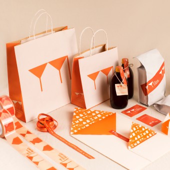
PRODUCTION / REALIZATION TECHNOLOGY: YM Coffee Project’s brand identity is not just about visual. To make people feel cozy, warm, comfortable mood, we make texture coordination. I choose paper, linen, wood, plants. All materials are eco-friendly and has basic natural colors. I think there has to be key point. I select orange color because orange can be highlighted between natural colors as you can see the color system. Oakwood’s color is dark brown and linen or paper’s color is ivory. Between them, there is also neutral color but I modify to vivid one to use as brand’s color. SPECIFICATIONS / TECHNICAL PROPERTIES: YM Coffee Project is on-going Project brand. Now there are YM Coffee House and YM Roasting Factory. YM Espresso Bar will come at 1Q 2020. Client needs the whole package for further, so I make elements for other projects. TAGS: keyvisual, brandidentity, visualidentity, logo, brandsystem RESEARCH ABSTRACT: For 5 months, I research coffee industry in Korea. There are so many coffee brands. But I find good coffee brand among them. They has expertise and recognizable shape or color. So I focus on shape and color to make brand identity. CHALLENGE: YM Coffee Project is on-going PROJECT. I have to consider not only existing projects but also future projects. It is hard to make system. To maintain consistency, I make basic elements for other projects’ visual identity. ADDED DATE: 2019-01-28 09:04:02 TEAM MEMBERS (3) : studio Lad, Creative Director : Bumseok Hong and Designer : Bumseok Hong IMAGE CREDITS: All Images : Photographer, Bumseok Hong Video Credits : Motiongraphic Designer, Bumseok Hong Images in PDF : Photographer, Bumseok Hong PATENTS/COPYRIGHTS: All copyrights reserved by studio Lad |
||||
| Visit the following page to learn more: http://www.studio-lad.com/ | |||||
| AWARD DETAILS | |
 |
Ym Coffee Project Brand Identity by Bumseok Hong is Winner in Graphics, Illustration and Visual Communication Design Category, 2018 - 2019.· Read the interview with designer BumSeok Hong for design YM Coffee Project here.· Press Members: Login or Register to request an exclusive interview with BumSeok Hong. · Click here to register inorder to view the profile and other works by BumSeok Hong. |
| SOCIAL |
| + Add to Likes / Favorites | Send to My Email | Comment | Testimonials | View Press-Release | Press Kit |
Did you like Bumseok Hong's Graphic Design?
You will most likely enjoy other award winning graphic design as well.
Click here to view more Award Winning Graphic Design.


