KannuNaUm Wine Labels by Giovanni Murgia - Redfish Adv |
Home > Winners > #74625 |
 |
|
||||
| DESIGN DETAILS | |||||
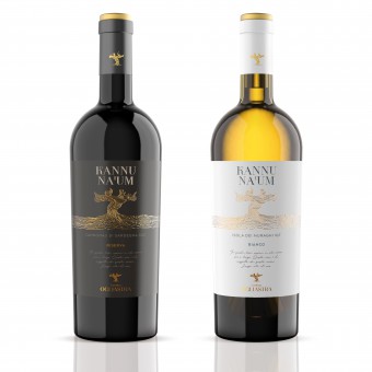
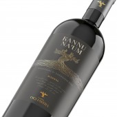
| DESIGN NAME: KannuNaUm PRIMARY FUNCTION: Wine Labels INSPIRATION: The strength of a unique land, the history of this people, the good environment and the secret of longevity. all these elements condensed on a single symbol: the golden grapevine. This represents the bond with this land, the history of this people and the essence of this wine, born from grapes of centenarian grapevines. UNIQUE PROPERTIES / PROJECT DESCRIPTION: The concept of these labels starts from the unique characteristic of these wines:the strength of a unique land, the history of this people, the good environment and the secret of longevity. Each of these elements is part of these wines and the labels that represent them.The symbol of the grapevine on this label represents all this, its golden color is the prestige of this great wine born from centenary vines and is the representation of the bond of winemakers with their historical and cultural roots. OPERATION / FLOW / INTERACTION: The design of these labels is designed to give a tactile effect when the bottle is picked up, thanks to the label paper and tactile processing. The visual effect is given by the embossing of the design of the grapevine. PROJECT DURATION AND LOCATION: The project is started in September 2018 and complete in December 2018 in Sassari (Sardinia, Italy). It is presented on media in February 2019 in Tortoli (Sardinia, Italy) FITS BEST INTO CATEGORY: Packaging Design |
PRODUCTION / REALIZATION TECHNOLOGY: The label was printed on special paper with a tactile sensation. This characteristic gives at the label a more prestigious and important role. The grapevine is obtained with a special printing technique called "cast gold" that gives a tactile sensation in relief with the elegant presence of gold. SPECIFICATIONS / TECHNICAL PROPERTIES: The labels are 120 mm x 130 mm TAGS: wine, history, label, sardinia, italy RESEARCH ABSTRACT: The research for the development of the design starts from the typical elements of this land. We are in Ogliastra - Sardinia, a land at the center of the Mediterranean sea. This is the land of Longevity, here there is the largest number of people reaching 100 years old. The name of the wine which means "our sapling", that is the vine that expands its roots in the territory. The grapevine is the history and the essence of life, the gold recalls the preciousness and elegance. CHALLENGE: The challenge for this label was to be able to transfer the importance of this wine that comes from the centenarian vines and that is connected with the history of these territories. ADDED DATE: 2019-01-24 08:35:06 TEAM MEMBERS (5) : Art direction: Giovanni Murgia, Designer: Giovanni Murgia, 3D render: Bruno Haver, Print: Tipografia Puddu and IMAGE CREDITS: Image 1: 3D designer Bruno Haver Image 2: 3D designer Bruno Haver Image 3: 3D designer Bruno Haver Image 4: 3D designer Bruno Haver |
||||
| Visit the following page to learn more: http://bit.ly/2WZ8VU9 | |||||
| AWARD DETAILS | |
 |
Kannunaum Wine Labels by Giovanni Murgia-Redfish Adv is Winner in Packaging Design Category, 2018 - 2019.· Press Members: Login or Register to request an exclusive interview with Giovanni Murgia - Redfish Adv. · Click here to register inorder to view the profile and other works by Giovanni Murgia - Redfish Adv. |
| SOCIAL |
| + Add to Likes / Favorites | Send to My Email | Comment | Testimonials | View Press-Release | Press Kit | Translations |


