Brist Extra Virgin Olive Oil Packaging by Tina Erman Popovic |
Home > Winners > #74354 |
 |
|
||||
| DESIGN DETAILS | |||||
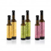
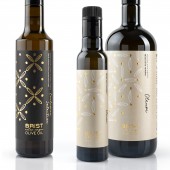
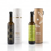
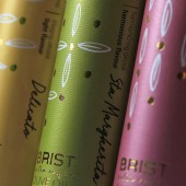
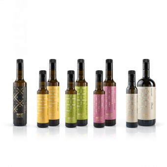
| DESIGN NAME: Brist Extra Virgin Olive Oil PRIMARY FUNCTION: Packaging INSPIRATION: The packaging design objectives were to visualize and express the values and soul of the brand, to create an image that would be attractive and recognizable and that stands out from its competitors. We found inspiration in the Sta Margherita olive grove, the history of the place, and the people behind the brand. With this new design we have achieved that each and every oil tells its own story. UNIQUE PROPERTIES / PROJECT DESCRIPTION: By differentiating the orientation of olive leaf patterns, each oil tells its unique story. Delicato is the horizontal leaf; mild, understated, balanced and subtle. Inspired by the sea and magical sunsets seen from the grove. Sta Margherita is a chapel from the 12th century, nestled deep in the family groves, a space that inspires. The Sta Margherita olive oil is the perfect harmony of mild and intense flavours, expressed through both horizontal and vertical elements. The strong flavours of Intenso are inspired by Vodnjan and its history; from Illyrian tribes, to Romans, to Venetians. The vertical element is the tower on the hill, and the strength of the Istrian people. Oleum is an oil of mixed varieties. Its tastes and aromas are nature’s choice, unique to each harvest year. Its elements are random, balanced by nature. Exclusive Selection oil is inspired by centennial trees. This pattern is contemporary yet with a feel of baroque style, a gesture towards history, tradition and time. OPERATION / FLOW / INTERACTION: - PROJECT DURATION AND LOCATION: The project started in March 2018 and finished in November 2018 in Vodnjan (Istra), Croatia. The rebranded oils were first presented at the event Dani mladog malsinovog ulja - Giornate dell'olio d'oliva novello in Vodnjan. FITS BEST INTO CATEGORY: Packaging Design |
PRODUCTION / REALIZATION TECHNOLOGY: The process of the highest quality olive oil production is based on a balance between a respect for nature, the art of oil blending and the use of cutting edge technology. We used different leaf orientations on the labels to communicate each oil’s uniqueness and its characteristics. The golden dots (hot stamping) representing olives are a reflection of the technology itself, controlled conditions and the consistency of production and bottling. Throughout all labels of the same volume, the dots are always placed in the same order and in the same position. Exclusive Selection is an exception to this in that it was decided with the client to distinguish this label by the total usage of gold hot-stamping and a separate cliche. The label texture and perlato effect adds exclusiveness. SPECIFICATIONS / TECHNICAL PROPERTIES: The dimensions of 0,5L bottels are 30 cm height and 5cm diametre, and 0,25L bottles 24 cm height and 6,5cm diametre. TAGS: brist olive, olive oil, extra virgin, Croatia, Vodnjan, Lastik studio, unique pattern, contemporary, modern, Tina Erman Popović RESEARCH ABSTRACT: - CHALLENGE: The hardest part of the redesign was finding the 'module'. We needed a module to achieve that each and every oil of 5 tells its own story, but still look as part of the same 'family'. Also, the demand from the client was to maintain a link to the old labels. So we maintained theirs specific colors, as existing customers mostly remembered oils by them (the yellow, green, pink oil…). But in the redesign we made labels in full color to achieve a more distinctive and contemporary design. ADDED DATE: 2019-01-16 21:48:15 TEAM MEMBERS (1) : Tina Erman Popović IMAGE CREDITS: Product photography: Dejan Hren |
||||
| Visit the following page to learn more: https://www.behance.net/tinae | |||||
| AWARD DETAILS | |
 |
Brist Extra Virgin Olive Oil Packaging by Tina Erman Popovic is Winner in Packaging Design Category, 2018 - 2019.· Read the interview with designer Tina Erman Popovic for design Brist Extra Virgin Olive Oil here.· Press Members: Login or Register to request an exclusive interview with Tina Erman Popovic. · Click here to register inorder to view the profile and other works by Tina Erman Popovic. |
| SOCIAL |
| + Add to Likes / Favorites | Send to My Email | Comment | Testimonials | View Press-Release | Press Kit |
Did you like Tina Erman Popovic's Packaging Design?
You will most likely enjoy other award winning packaging design as well.
Click here to view more Award Winning Packaging Design.


