Kalitva Product Catalog by Lana Raizen |
Home > Winners > #73261 |
 |
|
||||
| DESIGN DETAILS | |||||
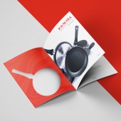
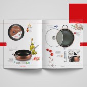
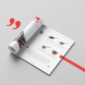
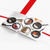
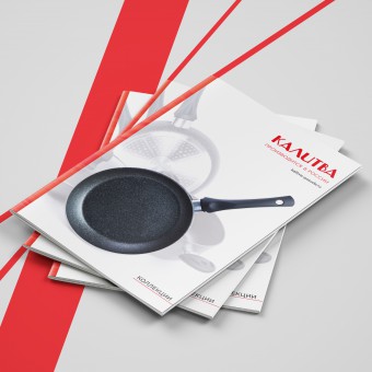
| DESIGN NAME: Kalitva PRIMARY FUNCTION: Product Catalog INSPIRATION: The beauty of the collections inspired me to such a presentation catalog. I wanted to show the advantage and uniqueness of each collection, its difference from others. UNIQUE PROPERTIES / PROJECT DESCRIPTION: The catalog of cooking utensils for Russian manufacturer. It shows the advantages of each collection, each item from a different angle. The overall picture is complemented by photos of food, spices, herbs. The main cover of the catalog is made with a cutting in the form of a frying pan, through which the color photo of the new collection shows through. The handles of the frying pans and pots on the second cover are varnished by soft-touch laque, imitating the actual coverage of these handles. Photo and video can not convey this effect and sensations. The catalog was presented by the company at an international exhibition HouseHold 2018. OPERATION / FLOW / INTERACTION: The catalog opens with information about the company and a description of the technologies that were used in the manufacture of utensils. Then there is the decoding of the main icons and symbols. The following is a section of premium collections with photographs, a detailed description and composition of each one. Then it shows popular collections with the same presentation structure. There is a section with classic aluminum cookware, which the company has been producing since 1954 at the end of the catalog. Recommendations for the care of each type of collection are described on the last pages and a sheet for notes finish the catalog. PROJECT DURATION AND LOCATION: The project started in July 2018 and finished in August 2018. Russia, Moscow and Novosibirsk |
PRODUCTION / REALIZATION TECHNOLOGY: Main cover: matt paper, 300g/m2, a cutting in the form of a frying pan. Second cover: glossy paper, 250g/m2, matt soft-touch laque on handles. Pages: matt paper, 170g/m2. SPECIFICATIONS / TECHNICAL PROPERTIES: Width 210 mm x Depth 9 mm x Height 250 mm TAGS: catalog, book, product, kalitva, design, creative, page, layout, booklet, brochure, utensils RESEARCH ABSTRACT: As a result of detailed familiarization and comparative analysis of all collections of utensils by this manufacturer, the most suitable spices, herbs and vegetables were selected, which complemented the design of the catalog and highlighted the advantages of each collection. I used the design with two main colors - white and deep red. The most collections are dark or black, they go well with that colors. CHALLENGE: The main difficulties arose with the selection of the most appropriate photos. But since there were no angles necessary for this design, it was decided to make a professional photo session for each collection. At this stage there was a difficulty in transmitting authentic colors and textures. But thanks to the game of lighting and professional processing, I achieved a realistic view of each subject. ADDED DATE: 2018-12-12 07:57:35 TEAM MEMBERS (1) : Lana Raizen IMAGE CREDITS: Photographer: Sergey Fedotov, Kalitva |
||||
| Visit the following page to learn more: http://bit.ly/2rMobq4 | |||||
| AWARD DETAILS | |
 |
Kalitva Product Catalog by Lana Raizen is Winner in Graphics, Illustration and Visual Communication Design Category, 2018 - 2019.· Press Members: Login or Register to request an exclusive interview with Lana Raizen. · Click here to register inorder to view the profile and other works by Lana Raizen. |
| SOCIAL |
| + Add to Likes / Favorites | Send to My Email | Comment | Testimonials | View Press-Release | Press Kit | Translations |
| COMMENTS | ||||||||||||||||||||
|
||||||||||||||||||||

