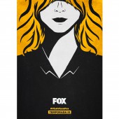
Vis a Vis Season 3 Posters Campaign by Fox Networks Group Spain |
Home > Winners > #72905 |
| CLIENT/STUDIO/BRAND DETAILS | |
 |
NAME: bhub Studio PROFILE: - |
| AWARD DETAILS | |
 |
Vis a Vis Season 3 Posters Campaign by Fox Networks Group Spain is Winner in Graphics, Illustration and Visual Communication Design Category, 2018 - 2019.· Press Members: Login or Register to request an exclusive interview with Fox Networks Group Spain. · Click here to register inorder to view the profile and other works by Fox Networks Group Spain. |
| SOCIAL |
| + Add to Likes / Favorites | Send to My Email | Comment | Testimonials | View Press-Release | Press Kit |


