Brothers Marketplace - Waltham Interior Design by BHDP Architecture |
Home > Winners > #72322 |
 |
|
||||
| DESIGN DETAILS | |||||
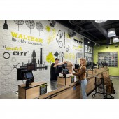
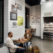
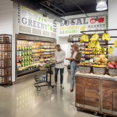
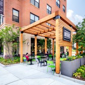
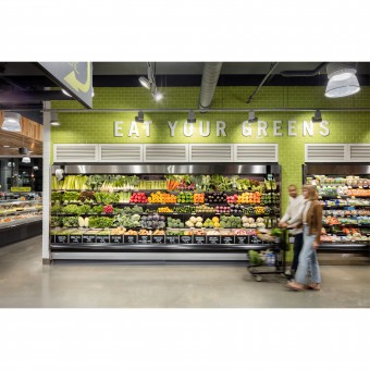
| DESIGN NAME: Brothers Marketplace - Waltham PRIMARY FUNCTION: Interior Design INSPIRATION: The store is designed to highlight the neighborhood of Waltham, MA and the Roche Bros. brand: Eat. Drink. Be Local. The team had a tour of the neighborhood to understand its culture, heritage, and demographics. Photos collected from the local historical society hang. The top hat is a nod to the towns annual steampunk festival. The cat hidden throughout is Walthams resident YouTube star Sockington the cat. The graphics reinforce the resurgence of Waltham as an up and coming neighborhood. UNIQUE PROPERTIES / PROJECT DESCRIPTION: The scope of this 12000 sf project is a complete store design including brand identity customer experience space planning interior exterior fixture and environmental graphic design. A key feature is to offer customers a one stop grocery and dining experience. The store is a collection of prepared foods meats produce and baked goods. Layered into this experience is the emphasis on being local. The mural content was designed by the project team and completed by a local mural artist. OPERATION / FLOW / INTERACTION: The new quarter entrance invites the early morning rush hour for a quick pastry and coffee where they can sit in the window and wait for the bus. For the residential guest the main aisle leads from bakery into consumables on one side and produce down the other. Guests drive to the location park inside the development at the rear and are greeted with a convenient back entrance. A secondary cafe and hot food offering slow the guest down before they checkout at the rear entrance. PROJECT DURATION AND LOCATION: 12 months start to finish Grand opening date of May 2018 Waltham MA FITS BEST INTO CATEGORY: Interior Space and Exhibition Design |
PRODUCTION / REALIZATION TECHNOLOGY: By leveraging our proprietary design process we first look to understand the strategic business goals of the client in this case the development of a small format prototype into a bedroom community in a strong downtown presence. We leveraged a series of visual image strategy and planning tools to create a customers journey and brand experience aligned with the goals. We relied heavily on google sketch up to visualize and continually adapt the design in collaboration with the clients. SPECIFICATIONS / TECHNICAL PROPERTIES: As a newly built developer space we ground and polished the concrete slabs acoustically insulated and sheet rocked the ceiling to damped the residential sounds above created architectural interest and focal with 3mm by 18mm ship lap and left moments of clean sheet rock walls for applied final messaging and hand painted murals on 2mm false brick panels. TAGS: Architecture, design, grocery, retail, interior design, graphics RESEARCH ABSTRACT: As a part of the design process the team completes a neighborhood audit an on site tour of the neighborhood to understand its unique culture heritage and demographics. The results of this research influence graphics as well as material palettes. CHALLENGE: 1. All the plumbing and piping from the residential above would be exposed in the typical open ceiling concept. We worked with the landlord to provide the acoustical insulation. 2. The developer limited the exterior signage. We introduced the brand color through the furniture and banners. To expose the brand more we developed a food cart to be used at the nearby park. 3. Fitting the minimal requirements to maximize selling area with limited space. Many of the back of house functions double uses. ADDED DATE: 2018-10-31 18:47:15 TEAM MEMBERS (4) : Interior Designer: Amanda Hyatt , Graphic Designer: Heather Storer , Design leader: Andrew Mcquilkin and Senior Architect: Chris Collett IMAGE CREDITS: All images/Mark Steele |
||||
| Visit the following page to learn more: http://www.bhdp.com/ | |||||
| AWARD DETAILS | |
 |
Brothers Marketplace-Waltham Interior Design by Bhdp Architecture is Winner in Interior Space and Exhibition Design Category, 2018 - 2019.· Press Members: Login or Register to request an exclusive interview with BHDP Architecture. · Click here to register inorder to view the profile and other works by BHDP Architecture. |
| SOCIAL |
| + Add to Likes / Favorites | Send to My Email | Comment | Testimonials | View Press-Release | Press Kit |

