Joshua Brand Identity by Jimmy Chew |
Home > Winners > #71812 |
 |
|
||||
| DESIGN DETAILS | |||||
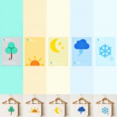
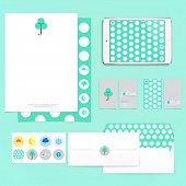
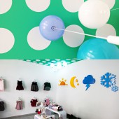
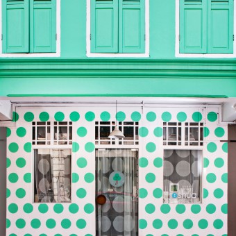
| DESIGN NAME: Joshua PRIMARY FUNCTION: Brand Identity INSPIRATION: Joshua is emotively developed with love that time with our kids has to be relished. Named after the client’s baby and drawing inspiration of strength from the Joshua tree, the design literature for the Joshua brand encompasses strength, love and joy, serving as a timeless remembrance of the love from mom to her baby. UNIQUE PROPERTIES / PROJECT DESCRIPTION: The visual communications for Joshua consist of brand identity, retail space and graphics design, including a visual identity of iconic pictograms, patterns and an array of joyful colors. Collectively, the elements exuberate a sense of playfulness and light-heartedness. Drawing inspiration from the Joshua tree, the logo identity is a hybrid of the Joshua’s tree silhouette and umbrella. The symbolism of umbrella has been selected to represent the unity and strength of the family to brave the storms of life together. As an apparel brand that caters for clothes of all seasons for babies and kids, pictograms of the seasons have been used as graphical elements within the retail design in the forms of pictogram signages and vinyl stickers. OPERATION / FLOW / INTERACTION: The visual communication designed for Joshua brand, from logo, colors, posters, iconography, collaterals, website and retail design have been designed to permeate positive feelings of strength, love, & joy. With the exterior of the retail design in boldly coloured polka dots, the first touchpoint exuberate joy and positivity. Mom’s reassuring words of love to baby are translated into vinyl stickers affixed to the glass windows. The interior of the retail design with simple iconography wall features, bright hues and playful furnitures have been designed to permeate positive feelings and enhance the good feelings of the consumer. Wall lights in the form of balloons have been sourced internationally to complement the intended mood for Joshua brand. PROJECT DURATION AND LOCATION: The project started in January 2013 and finished in January 2014 in Singapore . FITS BEST INTO CATEGORY: Graphics, Illustration and Visual Communication Design |
PRODUCTION / REALIZATION TECHNOLOGY: Offset printing, vinyl stickers printing and pictogram signages and custom furniture fabrication. SPECIFICATIONS / TECHNICAL PROPERTIES: High quality mirrorkote stickers are used for the retail design & window displays. All signages are wood laser cut and spray painted in high gloss. Posters are A2 sized. TAGS: brand identity, retail design, graphics design, service design, RESEARCH ABSTRACT: Research has been done to create a brand identity and retail design that can best represent the Joshua brand. All visual communications and colors have been specially planned and prototyped to ensure the best experience can be communicated. The color hues used for the pictogram signages and walls have been tested & treated to ensure that they look appealingly vibrant and modern. The eventual result is a playfully unique apparel brand identity that balances modern simplicity with subtle detailing, fresh color hues, playful graphics and pictograms. CHALLENGE: One of the process challenge is painting of the polka dots on the interior retail ceiling and exterior walls. In order to achieve clean circular dots, in the end we have to use sticker vinyls to achieve the crisp edge pasting them alternately on the ceiling surface. For the exterior wall, every polka dot is individually hand painted. ADDED DATE: 2018-10-05 09:12:00 TEAM MEMBERS (1) : IMAGE CREDITS: Image #2 : Photographer Ver Astro Image #3 : Photographer Ver Astro Image #4 : Photographer Ver Astro |
||||
| Visit the following page to learn more: https://idesignawards.com/winners/zoom.p |
|||||
| AWARD DETAILS | |
 |
Joshua Brand Identity by Jimmy Chew is Winner in Graphics, Illustration and Visual Communication Design Category, 2018 - 2019.· Press Members: Login or Register to request an exclusive interview with Jimmy Chew. · Click here to register inorder to view the profile and other works by Jimmy Chew. |
| SOCIAL |
| + Add to Likes / Favorites | Send to My Email | Comment | Testimonials | View Press-Release | Press Kit |

