Green Conut Handmade Soap by Zi Haui Shen |
Home > Winners > #71742 |
 |
|
||||
| DESIGN DETAILS | |||||
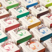
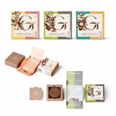
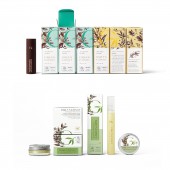
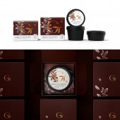
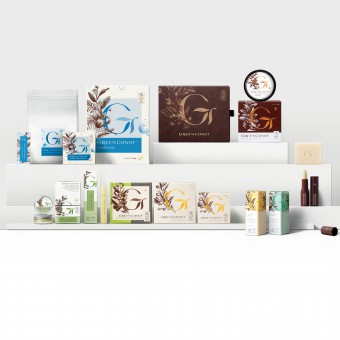
| DESIGN NAME: Green Conut PRIMARY FUNCTION: Handmade Soap INSPIRATION: The project strives to present the product's most natural scent by finding how to display the "unscented" UNIQUE PROPERTIES / PROJECT DESCRIPTION: Green Conut started out with professional handmade soap. It has been more than eight years since its establishment with diverse products and a loyal customer base. “Unscented” is the most unique feature of the products, giving it a good advantage in the market. However, the brand and packaging lacks clear recognition, positioning, and differentiation from other competitive products. Thus, the prominent features of the products are unable to be conveyed by its image. OPERATION / FLOW / INTERACTION: Brand recognition should be completely portrayed on product series packaging and the combination with the series features, color schemes, and illustrations of its ingredients will allow the brand packaging to not only be visually unified but also retain the series’ features. It conveys the advantages of the product. A new outer design for the soap series box is a solution for product information integration and systemization which helps consumers understand product content. A shared box model has also been designed to save costs on inventory and printing. The cover paper uses the same packaging material by design, and retains the old image while presenting its simplistic and beautiful quality. PROJECT DURATION AND LOCATION: The project started in October 2017 in Taiwan and was finished in February 2018. FITS BEST INTO CATEGORY: Packaging Design |
PRODUCTION / REALIZATION TECHNOLOGY: Box contains gold foil hot stamped. SPECIFICATIONS / TECHNICAL PROPERTIES: Unscented Soap: packaging dimensions are 10 x 10 x 3.5 cm, made of paperboard. Anti Mosquito: packaging dimensions are 5.5 x 5.5 x 4 cm, made of paperboard. Other sets are 12 x 3 x 3 cm Lip Balm: packaging dimensions are 10 x 3.5 x 3.5 cm, made of paperboard. Organic Pure Golden Shea Butter: packaging dimensions are 9 x 9 x 9 cm, made of paperboard. Other sets are 9 x 7 x 9 cm TAGS: Packaging design, Brand design, Handmade Soap, Taiwan design, Rebranding & corporate identity RESEARCH ABSTRACT: The unscented feature is the brand's most important element. In order to highlight its unscented feature, the source ingredients are illustrated using a single color (brown). The material is combined with the logo to form an auxiliary image which presents an unscented visual experience, thus strengthening and differentiating the brand features. It has also successfully stood out among similar products. CHALLENGE: Retaining unified brand recognition and the systemization of the series allows the products' features to become clear. At the same time, it saves printing costs and solves the problem of inventory. ADDED DATE: 2018-10-03 02:05:00 TEAM MEMBERS (1) : Zi Huai Shen IMAGE CREDITS: Zi Haui Shen, 2018. |
||||
| Visit the following page to learn more: https://www.sumpdesign.com | |||||
| AWARD DETAILS | |
 |
Green Conut Handmade Soap by Zi Haui Shen is Winner in Packaging Design Category, 2018 - 2019.· Read the interview with designer Zi Haui Shen for design Green Conut here.· Press Members: Login or Register to request an exclusive interview with Zi Haui Shen. · Click here to register inorder to view the profile and other works by Zi Haui Shen. |
| SOCIAL |
| + Add to Likes / Favorites | Send to My Email | Comment | Testimonials | View Press-Release | Press Kit |
| COMMENTS | ||||||||||||||||||||
|
||||||||||||||||||||
Did you like Zi Haui Shen's Packaging Design?
You will most likely enjoy other award winning packaging design as well.
Click here to view more Award Winning Packaging Design.


