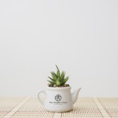
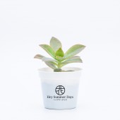
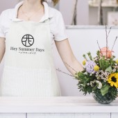
Hey Summer Days Logo Design Logo Design by The Branding Giants Pte Ltd |
Home > Winners > #71741 |
| CLIENT/STUDIO/BRAND DETAILS | |
 |
NAME: Hey Summer Days PROFILE: Hey Summer Days is a new start up that focuses on plants and flower pots. They are the solutions to plant lovers and hobbyist, providing an all round support for their needs from plant sourcing, to the desgner pots and workshops. |
| AWARD DETAILS | |
 |
Hey Summer Days Logo Design Logo Design by The Branding Giants Pte Ltd is Winner in Graphics, Illustration and Visual Communication Design Category, 2018 - 2019.· Read the interview with designer The Branding Giants Pte Ltd for design Hey Summer Days Logo Design here.· Press Members: Login or Register to request an exclusive interview with The Branding Giants Pte Ltd. · Click here to register inorder to view the profile and other works by The Branding Giants Pte Ltd. |
| SOCIAL |
| + Add to Likes / Favorites | Send to My Email | Comment | Testimonials | View Press-Release | Press Kit |
Did you like The Branding Giants Pte Ltd's Graphic Design?
You will most likely enjoy other award winning graphic design as well.
Click here to view more Award Winning Graphic Design.


