Appetisi Cheese by Fanny De Bray |
Home > Winners > #71461 |
 |
|
||||
| DESIGN DETAILS | |||||
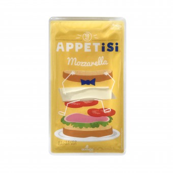
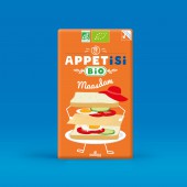
| DESIGN NAME: Appetisi PRIMARY FUNCTION: Cheese INSPIRATION: While conceiving this packaging we were inspired by plenty of other works such as the pasta packaging proposed by the russian agency Nikita. We appreciated the use of transparency. In the same way, the doodled snack packaging of J. Lally inspired us with their way of playing with the product's shape. UNIQUE PROPERTIES / PROJECT DESCRIPTION: The Granarolo group launched a new brand of cut out cheeses. They wanted to highlight that unique expertise, as they meet customer’s needs, providing a quick, practical and gourmet break. « Appetisi » promotes a practical and gourmet product. 3 ideas, one word: Appetite, Amuse bouche and Practical. The clear see-through area allows to see the cheese in a smart and amusing way. The embodiment of the products gives it that fun aspect, and aims to clearly define the different use of each product. OPERATION / FLOW / INTERACTION: This product is sold in supermarkets in Europe. Fromage product in France. PROJECT DURATION AND LOCATION: The project started in July 2017 and ended in February 2018. FITS BEST INTO CATEGORY: Packaging Design |
PRODUCTION / REALIZATION TECHNOLOGY: Plastic packaging with a transparent window to see the cheese. SPECIFICATIONS / TECHNICAL PROPERTIES: Dockpack : 150mm x 190 mm Slice of cheese : 127mm x 220 mm TAGS: Cheese, personification of cheese, fun, shift, desecration of cheese RESEARCH ABSTRACT: 1) brand platform 2) Naming 3) Logo 4) Packagings CHALLENGE: The most difficult was found. Whether it's cheese cubes, grated cheese or mozzarella dice, the cheeses are not yet wrapped. ADDED DATE: 2018-09-28 23:45:59 TEAM MEMBERS (2) : Fanny de Bray (Creative director) and Amandine Lantelme (Brand strategist and Copywriter) IMAGE CREDITS: Illustration : Fanny de Bray PATENTS/COPYRIGHTS: Copyrights belong to Fanny de Bray |
||||
| Visit the following page to learn more: https://www.madeforyou-agency.com/ | |||||
| AWARD DETAILS | |
 |
Appetisi Cheese by Fanny De Bray is Winner in Packaging Design Category, 2019 - 2020.· Press Members: Login or Register to request an exclusive interview with Fanny De Bray. · Click here to register inorder to view the profile and other works by Fanny De Bray. |
| SOCIAL |
| + Add to Likes / Favorites | Send to My Email | Comment | Testimonials | View Press-Release | Press Kit |


