The Fishermen And The Sea Program Visual Branding by Channel A B&C |
Home > Winners > #70931 |
 |
|
||||
| DESIGN DETAILS | |||||
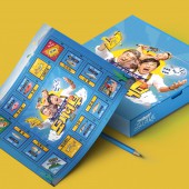
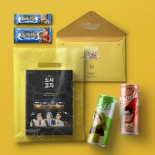
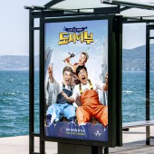
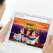
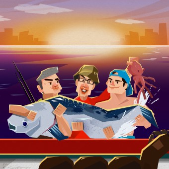
| DESIGN NAME: The Fishermen And The Sea PRIMARY FUNCTION: Program Visual Branding INSPIRATION: We firstly made importance on effectiveness in delivering information, and also the differentiation in visual designing. In order to change audiences' prejudice that the fishing is a hard and boring thing, we intended to make visual enjoyment to those people. In this process we tried to make characterized identities. As three main celebrities truly enjoy their fishing in real life, so it was not that hard to make them into characters. After we made the main characters, we developed other graphic designs that can express the enjoyment that we intended to show to the audience. UNIQUE PROPERTIES / PROJECT DESCRIPTION: Since September in 2017, ‘The Fishermen And The Sea’ now takes first place in viewer ratings among other programs that go on the air at the same time. In order to effectively visualize 'friendly and enjoyable' fishing activities, we use angled shapes, witty characters, vivid colors as our key design elements. Irregular and angled visual motif made its highly characterized design principle. This consistency in program design made this program unique from many other tv shows. OPERATION / FLOW / INTERACTION: The most important aspect of this design is to make people feel interesting about 'fishing'. We used angled shapes and vivid colors to make this visual design can describe fishing as 'friendly' and 'enjoyable' PROJECT DURATION AND LOCATION: This designed tv program is currently on-air since September 2017. It goes on the air every Thursday night 11pm in 'Channel A', which is one of tv broadcasting channels in Korea. |
PRODUCTION / REALIZATION TECHNOLOGY: Throughout the process we made, we used various design tools to make fresh design elements. We firstly developed through hand sketching the elements. Using hand sketch, we developed our key design like angled shapes, and then we mainly used adobe design program tools. We used Illustrator, After Effects, Photoshop, and etc. We made some formats which we can use in further variations, and we made some change in that format so that we could effectively do our design works. SPECIFICATIONS / TECHNICAL PROPERTIES: As we use our design in TV program, we made our work to fit into the standard of broadcasting system, which is 1920px*1080px in screen size. Although our design does not mainly depend on the size, as it is digital design, we prefer to make our design elements in vector formats so that we can use in various sizes. TAGS: Broadcast, Program, Branding, Visual Branding, On-Air, Ident, Channel, Design RESEARCH ABSTRACT: We have met people who do not actually know about fishing, because we had to define the needs of audience. As we expected, people did not have interest in fishing. In this process, we came up with idea that we should express fishing in some funny way, instead of using formal and serious designs. As a result, the design of this program could gain really good response from people. Even this program made many people go fishing for the first time, a kind of social impact. CHALLENGE: As we work in broadcasting company, we make many other program designs also. Usually we make an archive to make many graphic elements in a short time, so that many programs can go on the air in the mean time. However, as this program's design elements are so unique, we had to make every other elements when we were in need. At the first, we even thought it was time consuming to make every elements that fit into our visual guide. However, people realized our effort and we could make success. ADDED DATE: 2018-09-21 08:35:56 TEAM MEMBERS (5) : Creative Director : Yu Jisang, Project Manager : Oh HaeJung, Designer : Lee Namyi, Designer : Choi Jongbeym and Designer : Kim Raham IMAGE CREDITS: Channel A B&C, 2018. |
||||
| Visit the following page to learn more: https://www.youtube.com/watch?v=BmxT86em |
|||||
| AWARD DETAILS | |
 |
The Fishermen and The Sea Program Visual Branding by Channel a B&c is Winner in Digital and Broadcasting Media Design Category, 2018 - 2019.· Press Members: Login or Register to request an exclusive interview with Channel A B&C. · Click here to register inorder to view the profile and other works by Channel A B&C. |
| SOCIAL |
| + Add to Likes / Favorites | Send to My Email | Comment | Testimonials | View Press-Release | Press Kit |

