A Cozy Respite Commercial Office Reception and Lounge by Komorebi Pte Ltd |
Home > Winners > #70733 |
 |
|
||||
| DESIGN DETAILS | |||||
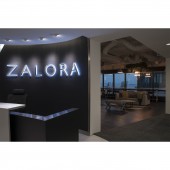
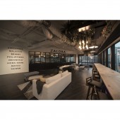
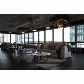
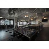
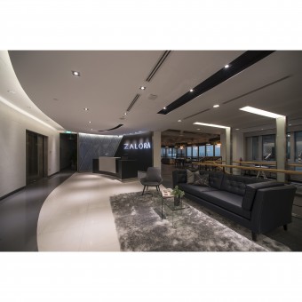
| DESIGN NAME: A Cozy Respite PRIMARY FUNCTION: Commercial Office Reception and Lounge INSPIRATION: The approach to the design of the reception area was to ensure that it aligns with the professional brand image of Zalora. As for the lounge area, the main aim was for it to be the perfect place for the office staff to take a breather from the keyboards. The area was surrounded by large window glass panels which brought in natural light. Hence, there was no need to install bright lights. A warm light temperature with its orangey glow was preferred to achieve a moody atmosphere for a more relaxing vibe. UNIQUE PROPERTIES / PROJECT DESCRIPTION: Upon reaching the reception of the Zalora office, one would be greeted by the expanse of a curved white wall that stretches all the way in. The majestic curvature acts like the extended arm of an usher, welcoming you into the space. Beyond the reception is a dual-purpose large space which can be bisected into two zones - lounge and training room. Where the lounge is, clusters of pendant lights that hang from the ceiling serve as main features. Fitted around the the lights are frames decorated with artificial greenery to evince a botanical vibe and soften the atmosphere. OPERATION / FLOW / INTERACTION: Bi-fold doors and panels segregate the area to contain the sound during meetings and discussions. Mobile furniture is strategically placed so they can be gathered when need be. The lights in the training room can be easily switched between warm and cool to fit the purpose of the area as it is being used. PROJECT DURATION AND LOCATION: Project completed in 2017, Singapore. FITS BEST INTO CATEGORY: Interior Space and Exhibition Design |
PRODUCTION / REALIZATION TECHNOLOGY: Treated with a travertine effect for a tactile quality, the reception wall is painted in a cool white shade which instantly brightens the area. The result is a clean look that projects a professional first impression. Pipes powder coated in stark white are used as part of the construction for the mobile furniture to portray a sharp contrast from the dimly-lit environment and dark flooring. SPECIFICATIONS / TECHNICAL PROPERTIES: This commercial unit has an area of 312 sqm TAGS: minimalist, professional, moody, botanical, office, reception, lounge, interior, commercial, Singapore, Komorebi RESEARCH ABSTRACT: Considering the great unblocked view, keeping the space open, yet having the flexibility to section the space for different purposes when needed, requires thinking out of the box. The flooring was laid diagonally to direct staff and guests to walk towards the best view. Bi-fold doors and panels are used to segregate the areas when needed. In addition, to keep the brand image professional, the transition between the reception, lounge area and training area cannot be abrupt. Hence, the choice of furniture, colour scheme, and lighting needs to keep the tone consistent. CHALLENGE: The lounge area needs to have the flexibility of being a lounge, a lounge and training room concurrently and a large meeting area where all the staff gather for their yearly meeting. ADDED DATE: 2018-09-16 10:34:57 TEAM MEMBERS (1) : IMAGE CREDITS: Memena Lee, Singapore, 2018 |
||||
| Visit the following page to learn more: http://www.artkomorebi.com/portfolio/A-C |
|||||
| AWARD DETAILS | |
 |
A Cozy Respite Commercial Office Reception and Lounge by Komorebi Pte Ltd is Winner in Interior Space and Exhibition Design Category, 2018 - 2019.· Press Members: Login or Register to request an exclusive interview with Komorebi Pte Ltd. · Click here to register inorder to view the profile and other works by Komorebi Pte Ltd. |
| SOCIAL |
| + Add to Likes / Favorites | Send to My Email | Comment | Testimonials | View Press-Release | Press Kit |

