Best Heritage Wine Label by César Moura |
Home > |
 |
|
||||
| DESIGN DETAILS | |||||
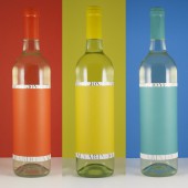
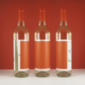
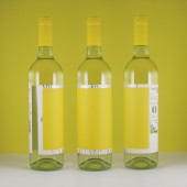
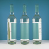
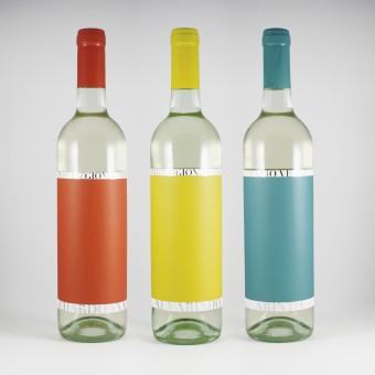
| DESIGN NAME: Best Heritage PRIMARY FUNCTION: Wine Label INSPIRATION: The inspiration for this design was happiness, well-being, and joyful moments. The most significant moments in our lives are the happy ones. Whether it is with friends, family or even in business. These times are sometimes kept in our memory. The beach, swimming pool, summer, sun, relationships are thoughts for a design that absorbs Nordic tendencies as far as the simplicity and liveliness of the object. UNIQUE PROPERTIES / PROJECT DESCRIPTION: This project comes as a part of the rebranding process for Best Heritage. Wine for drinkers not for tasters, this is the brand's motto. It is the way the company wishes to present itself: as an informal, easy-going and playful way to appreciate wine. The youthful and irreverent vibe was the guide during the design of the label, resulting in a minimal design with vibrant colors, full of unforgettable personality. OPERATION / FLOW / INTERACTION: The emotion the consumer feels was a major aspect we wanted to explore. The goal was to connect this product with happiness. The vibrant color palette was carefully chosen to play that role. Each bottle holds a bright colored canvas which can be used as a board to write a message to celebrate the occasion. The blue for a relaxing day by the pool, yellow for an old friends reunion or red for a passionate dinner. The consumer will create its own moments and associate them with the wine. PROJECT DURATION AND LOCATION: The project started in November 2017 and finished in February 2018. It was developed in Oporto. FITS BEST INTO CATEGORY: Packaging Design |
PRODUCTION / REALIZATION TECHNOLOGY: The labels were produced in offset with a silver foil stamp. The paper is a super white opaque plus, chosen carefully from Avery Dennison papers catalog. It's waterproof seeing as this type of wine, young wine, should be kept inside a frappe. SPECIFICATIONS / TECHNICAL PROPERTIES: The capacity of the bottles is 750ml, measuring 330mm in height and 70mm in diameter. The label involves the object with the following dimensions 210 x 140mm. TAGS: Wine, Label, Manifesto, Color, Bottle, Stamp, Packaging RESEARCH ABSTRACT: Walking down the supermarket aisle we mostly see white backgrounds, blending all brands together and making other labels that use color in large spaces stand out. Color is present in every aspect of our lives: it changes our mood instantly. Walking into a room filled with pastel hues will give you a sense of peace while in a room with vibrant ones will give you energy. We decided to play with that element and evoke different sensations in each bottle, creating an important interaction with the consumer. CHALLENGE: The main challenge was getting to a minimal design without turning it into a simple label. We must work directly with the sentiments we want the consumer to feel. Every person is unique, with different backgrounds and life experiences. Each one can bring their own interpretation to the table and feel different things when looking at the final product. Those feelings will turn it into a more personal object, creating a connection. Whether they like the design or not, they're more likely to remember it than if it was just another pretty product on the shelf. ADDED DATE: 2018-09-10 22:42:12 TEAM MEMBERS (1) : César Moura IMAGE CREDITS: César Moura |
||||
| Visit the following page to learn more: http://www.cesarmoura.com/ | |||||
| AWARD DETAILS | |
 |
Best Heritage Wine Label by César Moura is Runner-up for A' Design Award in Packaging Design Category, 2018 - 2019.· Press Members: Login or Register to request an exclusive interview with César Moura. · Click here to register inorder to view the profile and other works by César Moura. |
| SOCIAL |
| + Add to Likes / Favorites | Send to My Email | Comment | Testimonials |

