Light Bank UX Design Concept Mobile App Interface by Andrew Yeliseyev and Alex Kreger |
Home > Winners > #70595 |
 |
|
||||
| DESIGN DETAILS | |||||
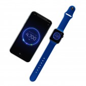
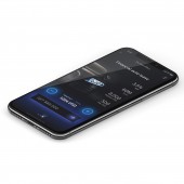
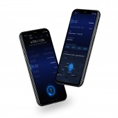
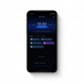
| DESIGN NAME: Light Bank UX Design Concept PRIMARY FUNCTION: Mobile App Interface INSPIRATION: The challenge of Light Bank was to design a concept of the simplest and the most beautiful banking app in the world, at the same time keeping the full-scale banking functionality. We gained inspiration from the miracle of nature and integrated it into our banking design. Light Bank is the synergy of light and simplicity that unites beauty with functionality, busting the myth of finance as something complicated and boring. This concept aims to inspire a change in the banking industry. UNIQUE PROPERTIES / PROJECT DESCRIPTION: In order to get closer to our goal - make the complicated world of finance a better place for the user, we dared ourselves to create the simplest, most beautiful and delightful mobile banking UI experience in the world, demonstrating it is possible to entirely maintain the full-scale digital banking functionality at the same time. OPERATION / FLOW / INTERACTION: Light Bank is the synergy of light and simplicity that unites beauty with functionality, busting the myth of finance as something complicated and boring. In order to edge closer to our goal and make the complicated world of finance a better place for the user, we dared ourselves to create the simplest, most beautiful and delightful banking user experience in the world, while maintaining the full-scale digital banking functionality at the same time. PROJECT DURATION AND LOCATION: The project started in March 2018 in Riga, Latvia and finished in August 2018 in Riga, Latvia. FITS BEST INTO CATEGORY: Interface, Interaction and User Experience Design |
PRODUCTION / REALIZATION TECHNOLOGY: UX deliverables via paper, Google Docs, UXPin. UI deliverables via Sketch App, After Effects, InVision. SPECIFICATIONS / TECHNICAL PROPERTIES: UI concept designed for Iphone X. TAGS: banking, fintech, bankingapp, mobilebanking, uxdesign, uidesign, bankux, bankui, mobileapp RESEARCH ABSTRACT: Researching user personas, allowed us to have an insight into the needs of our customers in order to engineer UX strategy, Information Architecture, and User Journey Map. We indicated a lot of pain points and concerns regarding existing experiences from financial services. Their main concern involved the complexity of the majority of the traditional banking services and its dreadful, outdated design. The design had to be easy to understand, simple to use, visually appealing and engaging. CHALLENGE: Who said a financial design has to be a pain, rather than something simple, beautiful and, most importantly, pleasant to use? Our main challenge was to convert complex multi-feature banking into user-friendly, intuitive interface that meets the needs of the users and provides the best value in a beautiful and delightful way. To achieve this in Light Bank, we considered usage patterns and habits, customers perception and cognitive psychology biases. ADDED DATE: 2018-09-08 12:59:23 TEAM MEMBERS (4) : Team lead/Ux strategist: Alex Kreger, Art director/UI & Motion designer: Andrew Yeliseyev, UX architect: Alberts Pumpurs and Business analyst/Researcher: Linda Zaikovska-Daukste IMAGE CREDITS: All images and video created by Andrew Yeliseyev. |
||||
| Visit the following page to learn more: http://www.uxdesignagency.com | |||||
| AWARD DETAILS | |
 |
Light Bank Ux Design Concept Mobile App Interface by Andrew Yeliseyev and Alex Kreger is Winner in Mobile Technologies, Applications and Software Design Category, 2018 - 2019.· Read the interview with designer Andrew Yeliseyev and Alex Kreger for design Light Bank UX Design Concept here.· Press Members: Login or Register to request an exclusive interview with Andrew Yeliseyev and Alex Kreger. · Click here to register inorder to view the profile and other works by Andrew Yeliseyev and Alex Kreger. |
| SOCIAL |
| + Add to Likes / Favorites | Send to My Email | Comment | Testimonials | View Press-Release | Press Kit |
Did you like Andrew Yeliseyev and Alex Kreger's Mobile Design?
You will most likely enjoy other award winning mobile design as well.
Click here to view more Award Winning Mobile Design.


