Fleur Pavilia Website by New World Development Company Limited |
Home > Winners > #70536 |
 |
|
||||
| DESIGN DETAILS | |||||
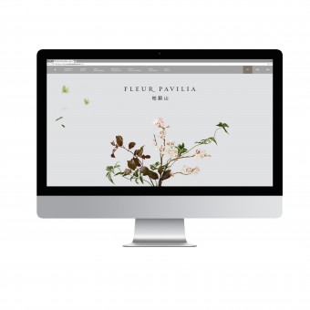
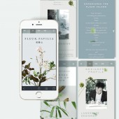
| DESIGN NAME: Fleur Pavilia PRIMARY FUNCTION: Website INSPIRATION: Inspired by the personas of The Three Friends of Winter, pine, bamboo and plum blossom, the image on the landing page provides a visual connection with its accompanying marketing collateral, the mood video and mood book: the elements of the page are seemingly unanchored and suspended in space to play with time and gravity. The website also showcases a profile for each of the signature plants of the Three Friends of Winter: pine, bamboo and plum blossom. UNIQUE PROPERTIES / PROJECT DESCRIPTION: The promotion website of Fleur Pavilia, New World Development’s latest residential development project in Hong Kong is in itself a piece of interactive art that draws from the atmosphere of the mood video. Navigation is simple and elegant to allow for focus on aesthetics, but without sacrificing readability. Each section of the website is clearly separated into white and grey spaces and is navigated by scrolling down. There are no hard, jarring transitions between each section, as they cleanly travel from one to another. The website also features a gallery of renderings of the clubhouse, landscape and units, again with simple dissolving transitions to keep the visitor immersed. The website is unique in that visitors may view the property’s surroundings at several points of the day with a scrollable panorama to showcase the flawless skyline. OPERATION / FLOW / INTERACTION: Upon landing the promotion website, visitors are greeted with an image of a plum blossom in the form of ikebana, Japanese floral arrangement tree in a grey expanse as meditative music plays and petals descend the screen slowly. The website employs artistic use of white and grey interspersed with floating, dissolving pieces of poetry to embody the idea of nature as spiritual and peaceful. Visitors would be able to find useful project information on this functional yet elegant website. The mood video, stories of The Three Friends of Winter, designer video and more are shown to bring out the essence and aesthetics of Fleur Pavilia. PROJECT DURATION AND LOCATION: The project started in 2016. |
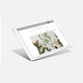
PRODUCTION / REALIZATION TECHNOLOGY: In collaboration with Ruth Chao, the promotion website is created and designed by Ruth and her team. It is a parallax website that allows content to flow into space as user discovers the website. The design process of the website began with study of the existing property identity and design concept of the property. Wireframes were created to enable a holistic look at how the UX would integrate with the UI. SPECIFICATIONS / TECHNICAL PROPERTIES: The site was given a fully responsive design to work well over multiple screen sizes, tablets and devices. TAGS: website, design, responsive, residential, property RESEARCH ABSTRACT: The design process of the website began with study of the existing property identity and design concept of the property. CHALLENGE: According to website designer, the most difficult part is to design how the petals should be moving over the website. Each petal descends in a different direction and pace. Every detail requires tremendous time and effort to craft. ADDED DATE: 2018-09-04 10:46:32 TEAM MEMBERS (1) : - IMAGE CREDITS: Image #1: Photographer appointed by Kinfolk, Plum Blossom, 2016. Image #2: Photographer appointed by Kinfolk, Bamboo, 2016. Image #3: Photographer appointed by Kinfolk, Pine, 2016. Image #4: Photographer appointed by Kinfolk, Bamboo, 2016. |
||||
| Visit the following page to learn more: http://bit.ly/2NQ1w5q | |||||
| AWARD DETAILS | |
 |
Fleur Pavilia Website by New World Development Company Limited is Winner in Website and Web Design Category, 2018 - 2019.· Read the interview with designer New World Development Company Limited for design Fleur Pavilia here.· Press Members: Login or Register to request an exclusive interview with New World Development Company Limited. · Click here to register inorder to view the profile and other works by New World Development Company Limited. |
| SOCIAL |
| + Add to Likes / Favorites | Send to My Email | Comment | Testimonials | View Press-Release | Press Kit |
Did you like New World Development Company Limited's Web Design?
You will most likely enjoy other award winning web design as well.
Click here to view more Award Winning Web Design.


