Analogue Photography Reference Book by Andrew Bellamy |
Home > Winners > #70513 |
 |
|
||||
| DESIGN DETAILS | |||||
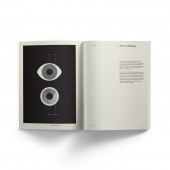
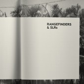
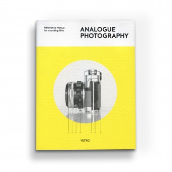
| DESIGN NAME: Analogue Photography PRIMARY FUNCTION: Reference Book INSPIRATION: Inspired by the aesthetic of vintage user manuals, this book is a beautifully-designed reference guide for everyone interested in film photography. With a Foreword by Florian Kaps, founder of the Impossible Project, it is the first book to reestablish the principles of this art form for an ever-growing demographic of film-lovers who grew up with digital, and are coming to analogue for the first time. UNIQUE PROPERTIES / PROJECT DESCRIPTION: This is a uniquley focused project realised entirely by a single author. The book was written by, designed and illustrated by Andrew Bellamy who finished it off with a bespoke typeface—35-FTR— OPERATION / FLOW / INTERACTION: The book features two features which take benefits of digital media interaction into an analogue medium. Inspired by the hyperlinking of encyclopedia websites, key terms that are relevant to—or explained in—another section of the book are underlined and listed in a cross reference section with the relevant page number to aid easy and quick referencing and non-linear reading. At the bottom of each page are progress bars, one to show how far the reader is through the chapter, and the other to show how far they are through the book. PROJECT DURATION AND LOCATION: The project started in Miami in 2010 as the website ilottvintage.com and was finished as a book in New York in 2016. The publishers of the European edition published in 2017 are based in Rome and Berlin. A German and Spanish translation and an American edition will be available at the end of 2018. The book is available online and in stores worldwide. FITS BEST INTO CATEGORY: Graphics, Illustration and Visual Communication Design |
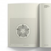
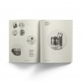
PRODUCTION / REALIZATION TECHNOLOGY: 192 page perfect bound book Hot foil on textured card for cover Uncoated ivory paper for pages ISBN: 978-88-943044-0-4 SPECIFICATIONS / TECHNICAL PROPERTIES: 16cm x 21cm x 2cm TAGS: print, book, photography, graphic, design, typography, analogue RESEARCH ABSTRACT: The content of the project was researched extensively to include the most accurate, relevant and comprehensive information possible, ranging from the essential fundamentals to more advanced details. The design was informed by researching books and manuals from the middle of the twentieth century to pinpoint key styles and techniques that were typical of the period such as typeface and illustration style. CHALLENGE: Other than to create a beautiful object that referenced a period style but felt completely relevant in a modern context, there were two main creative challenges with the design of the book. The first being to create artwork for a one colour print (black) and design illustrations with clearly differentiated tones. This was achieved with graphic pattern fills such as lines and dots rather than smooth gradients which enhances the vintage aesthetic and appeal. The second was to create a font which had a high x-height and low ascenders to fit easily digestible passages of copy onto a single page while allowing for clear legibility and readability. ADDED DATE: 2018-09-02 18:26:17 TEAM MEMBERS (6) : Author: Andrew Bellamy, Design & Illustration: Andrew Bellamy, Type design & Typography: Andrew Bellamy, Project management: Luca Bendandi, Technical advice: Giorgio Di Noto and Editing: John Z. Komurki IMAGE CREDITS: Andrew Bellamy, 2018. |
||||
| Visit the following page to learn more: https://ilottvintage.com/publications/ | |||||
| AWARD DETAILS | |
 |
Analogue Photography Reference Book by Andrew Bellamy is Winner in Print and Published Media Design Category, 2018 - 2019.· Read the interview with designer Andrew Bellamy for design Analogue Photography here.· Press Members: Login or Register to request an exclusive interview with Andrew Bellamy. · Click here to register inorder to view the profile and other works by Andrew Bellamy. |
| SOCIAL |
| + Add to Likes / Favorites | Send to My Email | Comment | Testimonials | View Press-Release | Press Kit |
Did you like Andrew Bellamy's Print Design?
You will most likely enjoy other award winning print design as well.
Click here to view more Award Winning Print Design.


