Torochi Rack by Romulo Teixeira and Cintia Miyahira |
Home > Winners > #70401 |
 |
|
||||
| DESIGN DETAILS | |||||
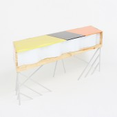
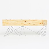
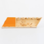
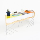
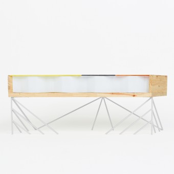
| DESIGN NAME: Torochi PRIMARY FUNCTION: Rack INSPIRATION: The geometric design was definitely the creative start point of Torochi. The base of the piece was a mixture of geometry and nature. Looking from the front, the base of the furniture looks like trees designed by a graphic designer. Viewed from above, the parallelogram that is often used in mathematics and geometry, was one of the designs chosen to be part of the idea. UNIQUE PROPERTIES / PROJECT DESCRIPTION: Torochi is a rack made to stand under the tv. It has three hanging slots with colored slots for controls, documents, pens, notebooks and so on. A container plate is a modern and industrial part of the design. The white color gives the clean look. Wood is the warmth and visual comfort. The colors are the fun. The base gives its lightweight visual effect to the furniture. OPERATION / FLOW / INTERACTION: Torochi is a TV rack. The independent spaces in the wooden box are made to hold whatever you need, usually objects related to the room or where the rack will be located. Since the container has a zigzag shape, the colored acrylic tops can be easily opened in front of the rack. PROJECT DURATION AND LOCATION: The project began in October 2017 and ended in April 2018. It started in Santos SP and was finished in Sao Paulo SP, Brazil. FITS BEST INTO CATEGORY: Furniture Design |
PRODUCTION / REALIZATION TECHNOLOGY: The white base that supports the wooden box is made of carbon steel with welds and electrostatic painting with a 10mm diameter bar. In the box, varnish was used as finishing. The base of the box is 30mm thick and the sides 18mm thick. The colored tops are acrylic with a thickness of 5mm. SPECIFICATIONS / TECHNICAL PROPERTIES: Width 1400mm x Depth 350mm x Height 500mm TAGS: Torochi, Rack, Wood, Steel, Storage, Colorful, Colors, Mezzanine, Acrylic, Brazil RESEARCH ABSTRACT: Since we already had a container plate, we decided to use it on an object that was a bit longer, in this case, a rack. The format of the rack would also have to be different, so the format of a parallelogram was used. CHALLENGE: Since the plate was an existing part that we would like to use in the design, the most complicated step of the process was to fit the plate into the rack visual. ADDED DATE: 2018-08-22 21:21:20 TEAM MEMBERS (2) : Architect: Cintia Miyahira and Architect: Romulo Teixeira IMAGE CREDITS: Image #1: Bruno Marcal Image #2: Bruno Marcal Image #3: Bruno Marcal Image #4: Bruno Marcal Image #5: Bruno Marcal |
||||
| Visit the following page to learn more: https://bit.ly/2LiaWoh | |||||
| AWARD DETAILS | |
 |
Torochi Rack by Romulo Teixeira and Cintia Miyahira is Winner in Furniture Design Category, 2018 - 2019.· Press Members: Login or Register to request an exclusive interview with Romulo Teixeira and Cintia Miyahira. · Click here to register inorder to view the profile and other works by Romulo Teixeira and Cintia Miyahira. |
| SOCIAL |
| + Add to Likes / Favorites | Send to My Email | Comment | Testimonials | View Press-Release | Press Kit | Translations |

