Kaleidoscope Lab Logo by Nicholas Kenton Lui |
Home > Winners > #70268 |
 |
|
||||
| DESIGN DETAILS | |||||
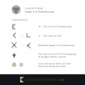
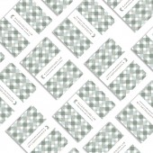
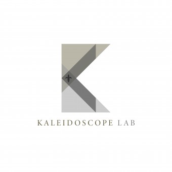
| DESIGN NAME: Kaleidoscope Lab PRIMARY FUNCTION: Logo INSPIRATION: Kaleidoscope Lab is a mentorship-driven programme powered by The Hongkong and Shanghai Hotels, Limited (HSH), also the owner of the luxury hotel brand The Peninsula Hotels. This traditional company has been wandering to enhance their guest experience and engagement with the use of technology and digital transformation. To keep itself being creative and innovative, it starts this programme to connect with the young start-ups, bringing them fruitful and diversified ideas. Thus, the name is chosen to appreciate the novel ideas from start-ups, as colorful as a kaleidoscope. UNIQUE PROPERTIES / PROJECT DESCRIPTION: The project is focused to create a visual identity for documents and other brand materials, which is luxury, elegant and brings the concept of Heritage Meets Innovation. As the image of reflections in a kaleidoscope is beautifully colorful and visually appealed, so this idea is brought into the trademark with the combination of its initials K and L, making the brand more unique and contemporary with the use of primitive triangles. A fleur-de-lis is also added to enhance its luxurious and the feeling of heritage. The color palette of gold and silver further sublimate the brand’s elegance. OPERATION / FLOW / INTERACTION: The contemporary, innovative brandmark appears in a classic well-known company surprisingly in Hong Kong, making an interesting entrance with the contrast created. The elegance of the gold and silver gives a presence of The Peninsula Hotels to arouse audiences’ interests on its technological transformation. A unique and classical pattern of triangles can also be formed with the components in the visual identity, like how an image being reflected endlessly in a kaleidoscope, so audiences are able to instantly refer it back to the brand. PROJECT DURATION AND LOCATION: The project was started in June 2018 and launched in August 2018 at Hong Kong. FITS BEST INTO CATEGORY: Graphics, Illustration and Visual Communication Design |
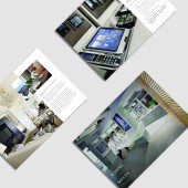
PRODUCTION / REALIZATION TECHNOLOGY: The brandmark is satin foil embossed to realize the reflecting effect in a kaleidoscope and enhance its luxuriousness and elegance. SPECIFICATIONS / TECHNICAL PROPERTIES: Basic stationery system for documents and publishing materials. However, the satin foil embossed logo creates a reflection indicating the concept of kaleidoscope. The touch of smooth and thin enhances the elegance and the luxuriousness of the brand. TAGS: Branding, Elegant, Heritage, Hong Kong, Innovation, Kaleidoscope Lab, Logo, Luxury, Technology, The Hongkong and Shanghai Hotels, Visual Identity RESEARCH ABSTRACT: The image of startups is usually contemporary and simple, with a direct and instant purpose or concept. To match with the sense of simplicity and contemporary, primitive shapes are frequently used and avoid adding overwhelming decorations. For the client, HSH is a traditional company with a 150-year history, therefore heritage is important to be mentioned in the brand of Kaleidoscope Lab. This concept is applied in the brandmark with the use of a royal symbol fleur-de-lis, which also keeps the classics of this traditional company. CHALLENGE: The largest challenge is immersing the concepts of Heritage with Innovation. According to the research about HSH and The Peninsula Hotels, they are old-fashioned and classical in terms of design. However, the Kaleidoscope Lab also aims to essence the concept of young and creative. Therefore, a balance between heritage and innovation has to be made in the brand. ADDED DATE: 2018-08-14 08:36:29 TEAM MEMBERS (1) : IMAGE CREDITS: Image #1: Creator Nicholas K Lui, Logo of Kaleidoscope Lab, 2018. Image #2: Creator Nicholas K Lui, Concept of KL Logo, 2018. Image #3: Creator Nicholas K Lui, Stationery Set with KL Brand, 2018. Image #4: Creator Nicholas K Lui, Document Design A, 2018. Image #5: Creator Nicholas K Lui, Document Design B, 2018. PATENTS/COPYRIGHTS: Copyrights belong to Nicholas Kenton Lui, 2018. |
||||
| Visit the following page to learn more: https://www.nicholasklui.com/work | |||||
| AWARD DETAILS | |
 |
Kaleidoscope Lab Logo by Nicholas Kenton Lui is Winner in Graphics, Illustration and Visual Communication Design Category, 2018 - 2019.· Press Members: Login or Register to request an exclusive interview with Nicholas Kenton Lui. · Click here to register inorder to view the profile and other works by Nicholas Kenton Lui. |
| SOCIAL |
| + Add to Likes / Favorites | Send to My Email | Comment | Testimonials | View Press-Release | Press Kit |

