Yoondesign Identity Brand Design by Sunghoon Kim and Chi-young Choi |
Home > Winners > #70002 |
 |
|
||||
| DESIGN DETAILS | |||||
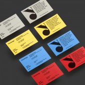
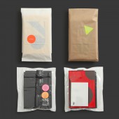
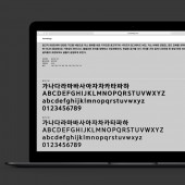
| DESIGN NAME: Yoondesign Identity PRIMARY FUNCTION: Brand Design INSPIRATION: The basic elements of a figure are points, lines, and surfaces. Dots are gathered to become a line, and the line becomes a surface. The shape varies from triangle to triangle to maximum circle. They consider the color saturation through three primary colors of light and three primary colors. Inspired by the expansion of shapes and the expansion of colors and tried to express the will of change. UNIQUE PROPERTIES / PROJECT DESCRIPTION: A pioneer of digital font design since 1989, Yoondesign offers a new platform that explores the link from font design to contents and brands. Their renewed identity allows us to express theirselves as a specialist group with the aim to broaden the spectrum of design. OPERATION / FLOW / INTERACTION: Their users experience not only professional typeface, but also the value of an extended typeface design by developing the relationship of contents and brands based on typeface through the application of redesigned identity and consistent application of it. PROJECT DURATION AND LOCATION: This project began in Seoul, South Korea in April of 2017 and ended in April 2018. FITS BEST INTO CATEGORY: Graphics, Illustration and Visual Communication Design |
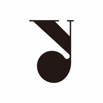
PRODUCTION / REALIZATION TECHNOLOGY: Yoondesign Identity concept is starting from a triangle. Each apex represents the relationship between typeface design, contents, and branding. It expands into a polygon, and then eventually a circle to represent their flexibility to change based on a variable graphic motif. Setting the basic tones of black and white as the embodiments of the light and pigment color primaries, their use of colors and graphic motifs are freely arranged to suit each medium. SPECIFICATIONS / TECHNICAL PROPERTIES: - TAGS: Visual Identity, Logo, Branding, Typography, Yoondesign RESEARCH ABSTRACT: - CHALLENGE: Yoondesign was a future-oriented company with the very first developing digital Korean fonts, but over time, the company became a traditional font design company. The "traditional&qu ADDED DATE: 2018-07-25 05:23:56 TEAM MEMBERS (2) : Art Director & Designer: Sunghoon Kim and Designer: Chi-young Choi IMAGE CREDITS: Main Image #1: Yoondesign, Optional Image #1: Yoondesign, Optional Image #2: Yoondesign, Optional Image #3: Yoondesign, Optional Image #4: Yoondesign |
||||
| Visit the following page to learn more: http://www.yoondesign.com | |||||
| AWARD DETAILS | |
 |
Yoondesign Identity Brand Design by Sunghoon Kim and Chi-Young Choi is Winner in Graphics, Illustration and Visual Communication Design Category, 2018 - 2019.· Press Members: Login or Register to request an exclusive interview with Sunghoon Kim and Chi-young Choi. · Click here to register inorder to view the profile and other works by Sunghoon Kim and Chi-young Choi. |
| SOCIAL |
| + Add to Likes / Favorites | Send to My Email | Comment | Testimonials | View Press-Release | Press Kit | Translations |

