Coffee Bean Here Packing by Vsevolod Abramov |
Home > Winners > #69430 |
 |
|
||||
| DESIGN DETAILS | |||||
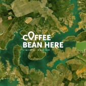
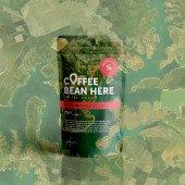
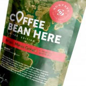
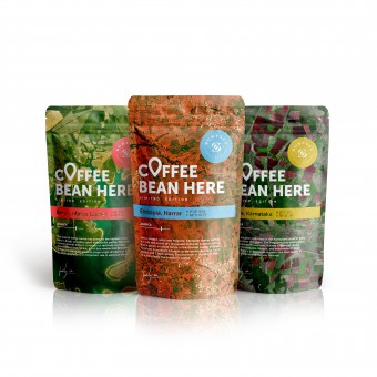
| DESIGN NAME: Coffee Bean Here PRIMARY FUNCTION: Packing INSPIRATION: The incredible beauty of our planet from a height inspired me to create this package. Just smart idea that will help reflect on the environment and the idea that our planet is our common home. the image of the area from a height looks unique and fascinating and I wanted to bring this idea to the design. UNIQUE PROPERTIES / PROJECT DESCRIPTION: Packaging shows the place where was born the coffee that you drink. Coffee bean is here has a double meaning. You can read this like coffee (has) been here also you can read this like “coffee bean is here” OPERATION / FLOW / INTERACTION: This package helps to take a different look at the product, it emphasizes its naturalness. We get a unique experience by interacting with it. PROJECT DURATION AND LOCATION: project was created in January 2018 FITS BEST INTO CATEGORY: Packaging Design |
PRODUCTION / REALIZATION TECHNOLOGY: Metallized doypack. Plastic bag with a bottom. This type of packaging is perfect for coffee. It is widely known and easy to replicate. SPECIFICATIONS / TECHNICAL PROPERTIES: Doypack. Width 135 mm x Depth 45 mm x Height 225 mm. TAGS: Coffee, Packaging, Geolocation, Map, Location, Green RESEARCH ABSTRACT: The coffee beans market is represented by a large number of different packages. We looked at all the examples from our price segment. We concluded that most packages use the image of the natural origin of the product is not bright enough. It was decided to reflect as much as possible the naturalness of the coffee beans with the help of packaging. CHALLENGE: The most difficult creative challenge was to link all meanings in one graphic concept. The geolocation label, an up-to-date and understandable symbol, served as the key to packaging. ADDED DATE: 2018-06-29 08:57:23 TEAM MEMBERS (1) : Vsevolod Abramov IMAGE CREDITS: Vsevolod Abramov, 2018. |
||||
| Visit the following page to learn more: https://bit.ly/2I4Ux8Y | |||||
| AWARD DETAILS | |
 |
Coffee Bean Here Packing by Vsevolod Abramov is Winner in Packaging Design Category, 2018 - 2019.· Read the interview with designer Vsevolod Abramov for design Coffee Bean Here here.· Press Members: Login or Register to request an exclusive interview with Vsevolod Abramov. · Click here to register inorder to view the profile and other works by Vsevolod Abramov. |
| SOCIAL |
| + Add to Likes / Favorites | Send to My Email | Comment | Testimonials | View Press-Release | Press Kit |
Did you like Vsevolod Abramov's Packaging Design?
You will most likely enjoy other award winning packaging design as well.
Click here to view more Award Winning Packaging Design.


