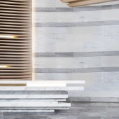
Muyun Valley Marketing Center Marketing Center by Yu Wenda and Wang Liang |
Home > Winners > #68961 |
| CLIENT/STUDIO/BRAND DETAILS | |
 |
NAME: Deep Concept PROFILE: DeepConcept is dedicated to providing high-quality interior design services for high-end customers in all walks of life. Focusing on making interior design for commercial spaces, clubs, restaurants, private houses, sample rooms and hotels etc., DeepConcept provides commercial real estate complexes, hotels, headquarters offices, brand chains and other enterprises with related overall services in various links including design and planning, placemaking, soft fitting accessories, design and making of artistic installation and engineering control, with an aim to build itself into a far-sighted professional design and planning service platform on the international market. Backed by excellent teams and expertise, we remain provident and innovative and provide unique space experience by integrating modern, artistic and cultural elements. |
| AWARD DETAILS | |
 |
Muyun Valley Marketing Center Marketing Center by Yu Wenda and Wang Liang is Winner in Interior Space and Exhibition Design Category, 2018 - 2019.· Read the interview with designer Yu Wenda and Wang Liang for design Muyun Valley Marketing Center here.· Press Members: Login or Register to request an exclusive interview with Yu Wenda and Wang Liang. · Click here to register inorder to view the profile and other works by Yu Wenda and Wang Liang. |
| SOCIAL |
| + Add to Likes / Favorites | Send to My Email | Comment | Testimonials | View Press-Release | Press Kit |
Did you like Yu Wenda and Wang Liang's Interior Design?
You will most likely enjoy other award winning interior design as well.
Click here to view more Award Winning Interior Design.


