Identity Room Accessory by Parisa Rafipour |
Home > Winners > #68959 |
 |
|
||||
| DESIGN DETAILS | |||||
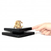
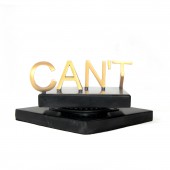
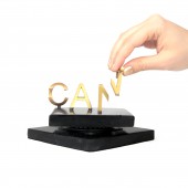
| DESIGN NAME: Identity PRIMARY FUNCTION: Room Accessory INSPIRATION: By combining design, social psychology and digital fabrication, Identity came to life. Design is used to show the importance of perspective in the reality we see. It shows the sense of identity from different perspectives. The one coming from the society can limit us based on gender, race, nationality, etc. But that is just a perspective and has nothing to do with who we actually can or cannot be. Identity inspires individuals to choose an empowering perspective to reach their full potential. UNIQUE PROPERTIES / PROJECT DESCRIPTION: Identity inspires to close diversity gaps based on labels that have nothing to do with who we can or cannot be. It combines classic product design with social design. It makes an impact both on an individual and social level starting with the mindset. It empowers people to choose a can mindset and be inspired. It invites the more privileged to a sense of understanding by showing the importance of perspective. Identity shows opposites can coexist and unite with changes of perspective and empathy. OPERATION / FLOW / INTERACTION: It has both a dynamic and a static way of interaction. It can stay on a shelf or desk to serve as a reminder to interrupt limiting habitual way of thinking. It inspires people to feel empowered with a change of perspective. It can also be dynamic by the user rotating the stand and attaching or detaching the parts with the magnets assembled into it. With this, more senses of people are engaged to feel and interact with the design. This sends an empowering message and is a source of inspiration. PROJECT DURATION AND LOCATION: The idea for the project started in September 2017 in Milan, Italy and was finished by April 2018. FITS BEST INTO CATEGORY: Fine Arts and Art Installation Design |
PRODUCTION / REALIZATION TECHNOLOGY: Innovation is at the core of this design and it is realized with the help of 3d printing technology. The material is a composite powder which is spray painted and assembled on a stand. The golden color represents the positive message and the light that the design brings to the dark (negative circumstances). It has the ability to rotate to show the change of perspective in action. The design is attached by magnets to the stand which makes the assembly, part of the experience of the user. SPECIFICATIONS / TECHNICAL PROPERTIES: The project has 2 parts: the base and the design. The base dimensions are: 130mm x 130mm x 40mm. The assembled design dimensions are: 100mm x 100mm x 40mm. TAGS: Meaningful Design, Empowerment, Inspirational, Identity, Labels, Society, Change of perspective, Social Design, mindset RESEARCH ABSTRACT: It highlights the connection between the labels and their effect on self perception. Limiting labels hurt both the person and the society. They prevent people from reaching their full potential and serving their community. People stop believing in themselves and lose their power to make an impact. Labels also separate people by making it all about us versus them and this causes conflict. An empowering way to perceive labels creates a sense of inclusion and makes our world a more balanced place. CHALLENGE: The first challenge was having two opposites coexist in one form with harmony. The design bridges the gap between two opposites with changes in perspective and showing the reality from that point of view. It is designed in a simple and direct way to bring the attention to its message. The second challenge was to engage people and involve more of their senses. The design should be assembled and it can rotate to change perspectives. This builds a sense of discovery and has an element of surprise. ADDED DATE: 2018-06-21 08:05:23 TEAM MEMBERS (1) : IMAGE CREDITS: Parisa Rafipour, 2018. |
||||
| Visit the following page to learn more: http://www.bmpdeco.com | |||||
| AWARD DETAILS | |
 |
Identity Room Accessory by Parisa Rafipour is Winner in Social Design Category, 2018 - 2019.· Press Members: Login or Register to request an exclusive interview with Parisa Rafipour. · Click here to register inorder to view the profile and other works by Parisa Rafipour. |
| SOCIAL |
| + Add to Likes / Favorites | Send to My Email | Comment | Testimonials | View Press-Release | Press Kit |


