DESIGN NAME:
Concerto
PRIMARY FUNCTION:
Residence
INSPIRATION:
This project was a newly finished housing project, the design team was first briefed about this project, the first order of business was to get rid of all partitioning but keeping the locations of kitchen and bathrooms, while the key to the re-layout was to enlarge the public space and the usage domain of the master bedroom, as well as to upgrade the supplementary function units of the two bedrooms.
UNIQUE PROPERTIES / PROJECT DESCRIPTION:
With the obvious differentiation in preference between the male and female clients, there needs to be a consensus in the layout, before moving on to the critical material selection, matching, and decorative items consideration. In order to satisfy the expectations of the client couple, the design team used lots of line work as the visual groundwork to accentuate the sense of modern design highlighted by its essential elements without the usual classical textural decoration and visual complexity.
OPERATION / FLOW / INTERACTION:
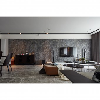
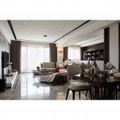
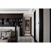
After the wall line is removed, the original beams and columns on site were naturally exposed, especially the beam above the living couch, so the design team first widened the beam volume with layers generated by the white-color base, grooved lines, and volumes, of which the low end carefully align with the white contour lines to form part of the ceiling formwork. And that gets complemented by the tailor-made sofa and the front-fascia design of the marble study desk so that the lowered beam has become the recessive medium that demarcates different spaces, which adds to the balance and harmony of visual perspective of the space.
PROJECT DURATION AND LOCATION:
The project started in January 2015 and finished in August 2016 in Taipei City.
FITS BEST INTO CATEGORY:
Interior Space and Exhibition Design
|
PRODUCTION / REALIZATION TECHNOLOGY:
Amongst all the materials, the design team regarded the naturalistic and unique marble as the ideal material to add to the design creativity, and furthermore, the male owner would like to have the public area in minimal design with grandeur, therefore, the design team selected a grey stone piece with great marble of texture for a single frontage traversing the living room and dining area to counter the limiting conventional mosaic piecing technique.
SPECIFICATIONS / TECHNICAL PROPERTIES:
The internal area of this project is around 120 square meters, as the design team adjusted the original four rooms into two rooms, so as to, on one hand, extend the visual depth of the public area, eliminate area wastage in corridor and in general, on the other hand, to significantly elevation the functionality and comfort of the private bedrooms, while establishing a storage space at the front section of the corridor to replace the expensive and space-consuming conventional cabinet.
TAGS:
Modern Minimalism, Disciplined, Minimal Grandeur, Sensibility, Disciplined
RESEARCH ABSTRACT:
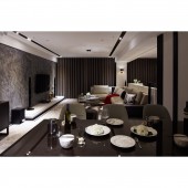
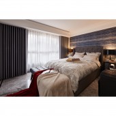
With the pristine visual depth of the modernist design, many craft-driven detailing and treatment of forms articulate the exquisiteness and romanticism of the classic styling is the key that gives the space its lively energy, in domains such as Entrance, Living Room, Dining Room, and Reading Area, and Master Bedroom.
CHALLENGE:
To calculate proportion accurately, to bring fragments together, and to strive for the most optimal floor-space usage, are the most primary purpose of modern space design, so that it can cater to the flexibility of the needs of life at various stages in the future, so the design team devised the most optimal the wall lines, according to the service shaft, structural columns, and window openings, etc., and systematic surface management to articulate the custom-made styling.
ADDED DATE:
2018-06-15 08:00:49
TEAM MEMBERS (1) :
Marcus Hsu
IMAGE CREDITS:
HUEI-JHONG HUANG
|


