Korea Institute of Arboretum Mgt. Corporate Identity by Sejong Icon |
Home > Winners > #68231 |
 |
|
||||
| DESIGN DETAILS | |||||
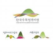
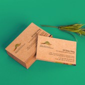
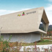
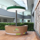
| DESIGN NAME: Korea Institute of Arboretum Mgt. PRIMARY FUNCTION: Corporate Identity INSPIRATION: Korea institute of arboretum management is taking part of managing and building institues of arboretum for restoration of reducing diversity of forest ecosystem and securing habitat spaces for forest creatures for preparation of global warming. To show the role of the institute effectively, we tried to visualize several meanings on the C.I. Therefore we visualized environment which contains variations and orders and the vision of the institute. UNIQUE PROPERTIES / PROJECT DESCRIPTION: As corporate identity of Korea institute of arboretum management is a flexible identity, we designed to improve individuality and unity of corporate identities of two institutes and a corporate identity of the institute which manage the two institutes. Moreover, this is challenging form of design breaking from the convention of typical logos. On the symbol mark, we put emotion of Korean traditional nature using four colors from Korean five traditional colors which is yellow, green, blue, red. OPERATION / FLOW / INTERACTION: - PROJECT DURATION AND LOCATION: - FITS BEST INTO CATEGORY: Graphics, Illustration and Visual Communication Design |
PRODUCTION / REALIZATION TECHNOLOGY: - SPECIFICATIONS / TECHNICAL PROPERTIES: - TAGS: Arboretum, management, Identity, CI RESEARCH ABSTRACT: - CHALLENGE: - ADDED DATE: 2018-05-04 06:18:52 TEAM MEMBERS (3) : Art Director: Siwook Oh, Art Director: Dukyong Kim and IMAGE CREDITS: Sejong Icon, 2018. |
||||
| Visit the following page to learn more: https://sejongicon.kr | |||||
| AWARD DETAILS | |
 |
Korea Institute of Arboretum Mgt. Corporate Identity by Sejong Icon is Winner in Graphics, Illustration and Visual Communication Design Category, 2018 - 2019.· Press Members: Login or Register to request an exclusive interview with Sejong Icon. · Click here to register inorder to view the profile and other works by Sejong Icon. |
| SOCIAL |
| + Add to Likes / Favorites | Send to My Email | Comment | Testimonials | View Press-Release | Press Kit |

