Sejong Facilities Management Corporation Corporate Identity by Sejong Icon |
Home > Winners > #68229 |
 |
|
||||
| DESIGN DETAILS | |||||
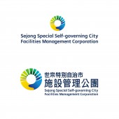
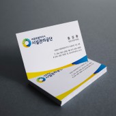
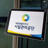
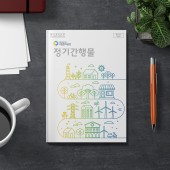
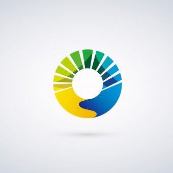
| DESIGN NAME: Sejong Facilities Management Corporation PRIMARY FUNCTION: Corporate Identity INSPIRATION: Sejong special self-governing city facilities management corporation is a government-affiliate UNIQUE PROPERTIES / PROJECT DESCRIPTION: Circle form of the logo means perfect and lasting facilities management. And the sections of the top means various facilities and for that we designed the radical shapes irregularly. Bottom of the logo means promising the best management for the people by representing hands shaking. Blue color shows that the corporation is belong to the city of Sejong. Yellow means the corporation serving the best management for the people. Green means eco-friendly city. OPERATION / FLOW / INTERACTION: - PROJECT DURATION AND LOCATION: - FITS BEST INTO CATEGORY: Graphics, Illustration and Visual Communication Design |
PRODUCTION / REALIZATION TECHNOLOGY: - SPECIFICATIONS / TECHNICAL PROPERTIES: - TAGS: Sejong, Facilities, management, Identity, CI RESEARCH ABSTRACT: - CHALLENGE: - ADDED DATE: 2018-05-04 06:05:48 TEAM MEMBERS (3) : Art Director: Siwook Oh, Art Director: Dukyong Kim and IMAGE CREDITS: Sejong Icon, 2018. |
||||
| Visit the following page to learn more: https://sejongicon.kr , https://www.sjfmc.or.kr | |||||
| AWARD DETAILS | |
 |
Sejong Facilities Management Corporation Corporate Identity by Sejong Icon is Winner in Graphics, Illustration and Visual Communication Design Category, 2018 - 2019.· Read the interview with designer Sejong Icon for design Sejong Facilities Management Corporation here.· Press Members: Login or Register to request an exclusive interview with Sejong Icon. · Click here to register inorder to view the profile and other works by Sejong Icon. |
| SOCIAL |
| + Add to Likes / Favorites | Send to My Email | Comment | Testimonials | View Press-Release | Press Kit |
Did you like Sejong Icon's Graphic Design?
You will most likely enjoy other award winning graphic design as well.
Click here to view more Award Winning Graphic Design.


