At Reform Showroom by Yasutomo Kumada |
Home > Winners > #68112 |
 |
|
||||
| DESIGN DETAILS | |||||
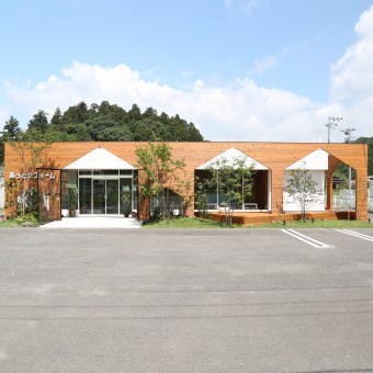
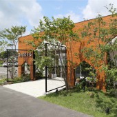
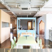
| DESIGN NAME: At Reform PRIMARY FUNCTION: Showroom INSPIRATION: It is inspired by the surrounding natural environment. We felt problems with buildings that appealed only to the commercial aspects of companies that disregarded the consideration for the surrounding environment and landscape. As much as possible, we thought about using local wood and planting to give consideration to the landscape. We did not give up on designs that could satisfy the commercial aspect as well. So we thought about a new facade that has both commerce and respect for landscapes. UNIQUE PROPERTIES / PROJECT DESCRIPTION: The facade has symbolic opening which shape is coming from company logo, and wrapping around existing building by using local wood in order to set up 1m of buffer zone. In the buffer zone, we set up a deck terrace and we transplanted the plants and stones growing in this area, and set up entrance to the showroom space. As for the interior space, I exhibited commodity into each independent box and set up community spaces as main space. OPERATION / FLOW / INTERACTION: In the showroom, the commodities that company wishes to promote are placed in the showcase as a secondary space, and we set up a community space where local people can do workshops as main space. Renovation company is not just a company that renews a toilet or a kitchen. They can change people lives and relationships, and can also create new lives and areas. So this has been town renovation company and it has become show room where opened to the community. PROJECT DURATION AND LOCATION: The project started in July 2016 in Fukushima and finished in July 2017 in Fukushima, and was Opened on July 24 2017. FITS BEST INTO CATEGORY: Architecture, Building and Structure Design |
PRODUCTION / REALIZATION TECHNOLOGY: This facade becomes experienced spatial facade. In the buffer zone, we set up a deck terrace, transplanted the local plants and stones, and set up entrance to the showroom space. As for the interior space, I exhibited commodities into each independent boxes and made it in such a way as to look at the home life from window. Visitors can have a continuous experience like walking streets between facade and interior space. SPECIFICATIONS / TECHNICAL PROPERTIES: The dimension of this building are followings. Dimension, 15000mm×5500mm×380 TAGS: architect, showroom, Commercial building, Local Community, town planning, japan, Architecture, RESEARCH ABSTRACT: In creating a showroom, there was a problem that the utilization ratio of the showroom space was very low. On the other hand, as a regional opinion, there was a survey result that people with talent such as cooking and manufacturing are not presenting places to show off their abilities because there is no parking space and no space for children to play. Therefore, we set up a community space in the showroom where local people gather, and started a project to support community activities. CHALLENGE: Convenience store has strong memory, as a regional infrastructure, has a distinctive shape. This building is also a rental property. Due to the problem of recovery from the present situation, it is not possible to change the shape of the buildings. However, we had to harmonize this building with the beautiful area. Therefore, in this case, by providing a facade having a buffer zone, Expressing the corporate identity, positively solving problems that can not change the shape of the building. ADDED DATE: 2018-04-19 03:03:06 TEAM MEMBERS (1) : IMAGE CREDITS: Yasutomo Kumada, 2018. |
||||
| Visit the following page to learn more: https://atreform.com/ | |||||
| AWARD DETAILS | |
 |
At Reform Showroom by Yasutomo Kumada is Winner in Architecture, Building and Structure Design Category, 2018 - 2019.· Read the interview with designer Yasutomo Kumada for design At Reform here.· Press Members: Login or Register to request an exclusive interview with Yasutomo Kumada. · Click here to register inorder to view the profile and other works by Yasutomo Kumada. |
| SOCIAL |
| + Add to Likes / Favorites | Send to My Email | Comment | Testimonials | View Press-Release | Press Kit |
Did you like Yasutomo Kumada's Architecture Design?
You will most likely enjoy other award winning architecture design as well.
Click here to view more Award Winning Architecture Design.


