Braspag Payment Technology Company Branding by Ruis Vargas |
Home > Winners > #68046 |
 |
|
||||
| DESIGN DETAILS | |||||
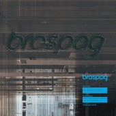
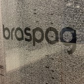
| DESIGN NAME: Braspag PRIMARY FUNCTION: Payment Technology Company Branding INSPIRATION: The concept of timelessness was fundamental to the design of the new Braspag brand. The typographic design of the logo refers to Paul Renner's Futura typography, however, in a contemporary re-reading, presenting sinuosities in punctual details, bringing the liquid component in its composition. The typographic structure allows to receive diverse plastic variations, breaking with the rigid models of construction of corporate visual identity. UNIQUE PROPERTIES / PROJECT DESCRIPTION: Braspag is the leader in the electronic payments segment in Brazil and incubator of new technologies from Cielo. The company contributes with accelerated transformations in its business model, much in function of the dynamics and the changes of the digital world. Thus, the new brand needed to account conceptually and graphically of the fluid and fast sense of the sector without losing its original identity. Laika sought to build a visual identity graphics platform that represented this trend. OPERATION / FLOW / INTERACTION: By adopting the new logotype, Braspag abandoned the previous model of the imagotype, defined in its essence by the figurative element. Such a construction model offers a rigid sense of meaning, since it represents something specific. Thus, by opting for the logotype, Braspag floats with more speed by the changes of the segment in which it operates, without segregating itself by the pictorial representation. The logotype is the platform of visual representation of the brand, keeping itself as daily innovation and platform of mutations. PROJECT DURATION AND LOCATION: The project started in May 2018 and finished in October 2018 in Sao Paulo, Brazil. FITS BEST INTO CATEGORY: Graphics, Illustration and Visual Communication Design |
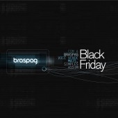
PRODUCTION / REALIZATION TECHNOLOGY: The graphic possibilities in the construction of the new Braspag brand go through experimentation in plastic aspects to tactile and environmental experiences. Laika presents a range of applications of the Braspag brand in panels (translucent acrylic superimposed on frosted adhesive), glass walls, two-dimensional arts (showing brand deconstruction) and animations (exploring brand narrative). SPECIFICATIONS / TECHNICAL PROPERTIES: Panel brand hall office Rio de Janeiro: composition in translucent acrylic on matte adhesive. Glass wall: transparent adhesive printed with UV ink. Animation channel Braspag: animation developed integrating the tools of Adobe edition of design and video; soundtrack developed exclusively for the video. TAGS: Logotype, typography, visual communication, visual identity, brand RESEARCH ABSTRACT: The Laika method is based on the complete synergy between language skills and pictorial aspects of communication. The project begins with the construction of meaning (semiological aspect) and the need to design small graphic narratives relevant to the brand. The foundation of the new Braspag brand started from the process of immersion with employees and management, mapping, through surveys, the image universe and the culture of the brand to then materialize concepts graphically. CHALLENGE: The transformations of the technological sector of online payment means are fast. Thus, Laika was given the challenge of redesigning the Braspag brand and implementing a visual language model that would graphically represent the transformations of the sector. Thus, the typographic design was structured in such a way as to accommodate, in its structure, graphic interferences of the most diverse aesthetic nuances, without losing its original composition aspect. ADDED DATE: 2018-04-08 05:26:15 TEAM MEMBERS (1) : Creative Director: Ruis Vargas IMAGE CREDITS: Laika Design PATENTS/COPYRIGHTS: Laika Design |
||||
| Visit the following page to learn more: http://www.laika.com.br | |||||
| AWARD DETAILS | |
 |
Braspag Payment Technology Company Branding by Ruis Vargas is Winner in Graphics, Illustration and Visual Communication Design Category, 2018 - 2019.· Read the interview with designer Ruis Vargas for design Braspag here.· Press Members: Login or Register to request an exclusive interview with Ruis Vargas. · Click here to register inorder to view the profile and other works by Ruis Vargas. |
| SOCIAL |
| + Add to Likes / Favorites | Send to My Email | Comment | Testimonials | View Press-Release | Press Kit |
| COMMENTS | ||||||||||||
|
||||||||||||
Did you like Ruis Vargas' Graphic Design?
You will most likely enjoy other award winning graphic design as well.
Click here to view more Award Winning Graphic Design.


