Meetin Japan Japanese Restaurant by Jun Murata |
Home > Winners > #67510 |
 |
|
||||
| DESIGN DETAILS | |||||
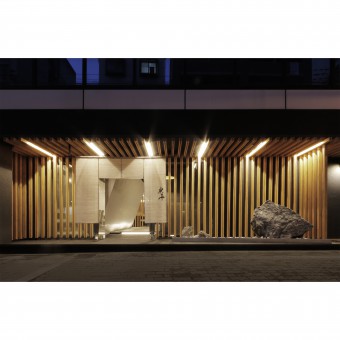
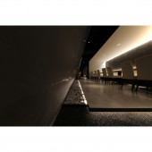
| DESIGN NAME: Meetin Japan PRIMARY FUNCTION: Japanese Restaurant INSPIRATION: The outer circumference of the store is merely a black box. It divides it into six areas. It is a box with diagonal walls, two white boxes, a gray box, a long box, and a lattice counter seat. This has led to a reduction in construction costs, as well as separate flow lines to four different rooms. Each of them has a characteristic finish and a passage with black gravels on both ends is continuous so as to connect them. UNIQUE PROPERTIES / PROJECT DESCRIPTION: MEETIN is a brand-new Japanese restaurant with its main store in Shanghai and branches in Beijing and Chongqing. It's the Japan branch of it. The restaurant is comprised of sensitive texture, clear forms, minimalist detailing, and a thoughtful composition of lighting. The design seeks to promote a tranquil and calm aspect, appropriate to the meal and healing of guests. The inside contains 5 guest's area and an open kitchen. In the black box, a simple material palette includes gray stucco walls, white walls, complemented by wood furnishings. The facade contains wooden louvers and the rock garden. OPERATION / FLOW / INTERACTION: The lighting plan is based on warm color, and impressively reflects the setting which the craftsman crafted carefully. It is precisely planned so that guests can enjoy a slow meal. PROJECT DURATION AND LOCATION: The project started in November 2017 in Osaka, Japan and finished in March 2018 in Osaka. FITS BEST INTO CATEGORY: Interior Space and Exhibition Design |
PRODUCTION / REALIZATION TECHNOLOGY: venetian stucco, black gravel, wooden louver, rock SPECIFICATIONS / TECHNICAL PROPERTIES: The approach of design was practical and flexible at the same time. How to make a pharmacy user, or a passenger passing by it, understand that this pharmacy provides the best medicines? And how could it be outstanding compare to other dispensing pharmacies. The starting point is to think about what was the expectation that a patient would have from this institution, the answer was: Healing. The next step was a research of how to objectify the concept of healing. TAGS: restaurant, stucco, indirect lighting, wooden louver, black gravel, rock garden, zen RESEARCH ABSTRACT: Initially, this shop was trying to operate two stores with different business categories by one kitchen. For that reason, the concept of the store was uncertain and uncertain. After many meetings with the company several times, the answer was a variation. It was to respond to a wide range of needs by setting unequal differences for each audience seating, responding to customers' nationality, age, and staying time. CHALLENGE: Each branches of MEETIN in mainland China were designed to imitate traditional Japanese style. In other words, harmony with the surrounding environment was not considered. Then, we thought thoroughly the needs of the circumference. How about the setting of price and taste are required? Searching for a new value in this area, we have set the best menu and services, the grade of overall space was decided. ADDED DATE: 2018-03-25 05:27:55 TEAM MEMBERS (1) : Jun Murata IMAGE CREDITS: Jun Murata PATENTS/COPYRIGHTS: Jun Murata |
||||
| Visit the following page to learn more: http://www.junmurata.com/aji | |||||
| AWARD DETAILS | |
 |
Meetin Japan Japanese Restaurant by Jun Murata is Winner in Interior Space and Exhibition Design Category, 2017 - 2018.· Press Members: Login or Register to request an exclusive interview with Jun Murata. · Click here to register inorder to view the profile and other works by Jun Murata. |
| SOCIAL |
| + Add to Likes / Favorites | Send to My Email | Comment | Testimonials | View Press-Release | Press Kit |


