A Way Out of the Mirror Artist Book by Stefan Canuel |
Home > Winners > #67497 |
 |
|
||||
| DESIGN DETAILS | |||||
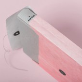
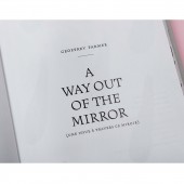
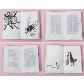
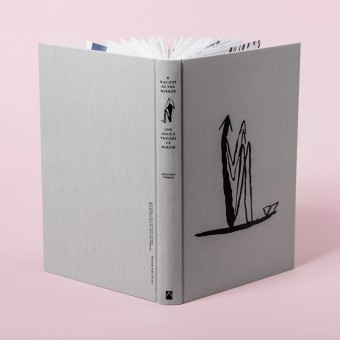
| DESIGN NAME: A Way Out of the Mirror PRIMARY FUNCTION: Artist Book INSPIRATION: The design of the book was based on a children’s storybook that tells a tale through images. The main character is a exaggerated form praying mantis, understood as a self-portrait of the artist as a young man. Titled after an Allen Ginsberg poem, A Way Out of the Mirror includes over two hundred drawings deliberately printed on thin paper, to enable the drawing on the verso of the page to show through. UNIQUE PROPERTIES / PROJECT DESCRIPTION: Working in close collaboration with Vancouver-based artist Geoffrey Farmer, the goal was to design a book to complement his exhibition in the Canada pavilion at the 2017 Venice Biennale. The exhibition was composed of a number of bronze sculptures. The imagery and symbols of the sculptures were drawn from Farmer’s personal history, including his relationship with his father and a car accident that claimed the life of his grandfather. OPERATION / FLOW / INTERACTION: When you carefully removed the book from the envelope you would see the stamped title A Way Out of the Mirror appear on the spine. Tyvek was chosen for its outstanding water resistance to both complement and withstand Farmer’s sculptural waterworks that were part of the Biennale exhibition. The colour pink was chosen to represent the artist. PROJECT DURATION AND LOCATION: The project started in November 2016 in Ottawa, Canada and finished in April 2017 in Firenze, Italy. |
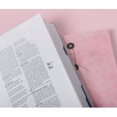
PRODUCTION / REALIZATION TECHNOLOGY: The drawings, which were specifically created by the artist for the book, are at once perfectly readable through their simplified style, and poignant through the evocative imagery. At the end of the book a glossary of terms compiled by curator Kitty Scott represents the artist’s approach to the exhibition. The special edition of the book was packaged in a personalised Tyvek pink envelope. SPECIFICATIONS / TECHNICAL PROPERTIES: 268 pages casebound, round-back book (sewn into book blocks, trimmed to size, spine is glued, and hardcover bound to 2.5mm thick binder's board). Printed 4 colors process on Artic Paper; Munken Print White (80 g/m2). The cover and spine were letterpress printed with Pantone black ink on light linen fabric. The sleeve was printed full bleed on 4 sides in Pantone yellow with type knockoff on clear polypropylene. The sleeve was open on both sides to allow the book to slide easily when push. The special edition of the book was packaged in a personalized Tyvek envelope printed one Pantone 706U. Sizes: 20.0 x 30.6 x 3.0 cm TAGS: Contemporary Art, publishing, Artist Book, Book, Catalogue, Exhibition, Art, Editorial, Publishing, Page Spread RESEARCH ABSTRACT: Research & Analysis – This phase usually entails taking into account the artist’s past catalogues, market trends for contemporary art books, the history of the artist, in this case Geoffrey Farmer, his future production, and the future of the publication as well. When trying to convey a design idea I will often use mood boards. Strategy – Developing a strategy before putting pencil to paper. In this case it was the creation of a story book and finding a key work that would represent the story main character. Running the strategy to the artist to get approval or disapproval was necessary at this stage. Development – Developing several different concepts. The idea here was to create as many different options before choosing the most viable one. Through the help of the curator, these ideas were narrowed down to one or two ideas for further development and refinement. Presentation – Presenting a good amount of inside spreads for the book. Making a paper mock-up for the cover and case was also a good idea for this project. It was the time for the client to review the designs and provide feedback based on their objectives and needs. Production – With an approved design, I was now able to hand over the finished piece and, outsource and supervise a third-party to typeset all galleys. CHALLENGE: Working with an artist on a book can be a challenge. It is crucial that an artist’s work is respected, yet at the same time it is important to add another dimension to give depth and autonomy to the final product. It was important to relate to the artist the value in making a book that would be an object in its own right. ADDED DATE: 2018-03-24 00:19:13 TEAM MEMBERS (10) : Designer: Stefan Canuel, Artist: Geoffrey Farmer, Author: Kitty Scott, Typesetter: Natalie Ann Garneau , Editor: Caroline Wetherilt, Editor: Audrey Camus, Editor: Marie-Christine Gilbert , Production Manager: Anne Tessier, Translator: Christine Gendreau and IMAGE CREDITS: Illustrations: Artist Geoffrey Farmer, 2017 |
||||
| Visit the following page to learn more: https://scanuel.myportfolio.com | |||||
| AWARD DETAILS | |
 |
A Way Out of The Mirror Artist Book by Stefan Canuel is Winner in Print and Published Media Design Category, 2017 - 2018.· Press Members: Login or Register to request an exclusive interview with Stefan Canuel. · Click here to register inorder to view the profile and other works by Stefan Canuel. |
| SOCIAL |
| + Add to Likes / Favorites | Send to My Email | Comment | Testimonials | View Press-Release | Press Kit |

