Our Stories Exhibition by Stefan Canuel |
Home > Winners > #67335 |
 |
|
||||
| DESIGN DETAILS | |||||
| DESIGN NAME: Our Stories PRIMARY FUNCTION: Exhibition INSPIRATION: We had to create a visual identity with aesthetic appeal that also communicated our key messages, concept and image to visitors of all ages, while meeting the limitations imposed by space and budget. The design moved visitors through eight sections where they could learn how artworks in various media are made, where they could understand the regional and cultural diversity of art in Canada, and share their own creativity through digital activities. UNIQUE PROPERTIES / PROJECT DESCRIPTION: The task was to create an orientation space that would introduce the visitors, with a wide range of interests and motivations, to the history of art in Canada. It had to be engaging, interactive and responsive to multiple learning styles while helping visitors make connections between the multiple offerings on view. The experience in the learning space had to increase visitors’ comfort level with being in a gallery setting, and had to prepare them to interpret art in personal meaningful ways. OPERATION / FLOW / INTERACTION: The content and approach of interactives were developed using visitor research that told us visitors want to know how art is made and the historical context in which artworks are produced. Interactive components were designed to respond to the needs of multiple core target audience segments. For example, a table-top map featuring key artworks from each region of Canada appealed to children who enjoy interactivity (pressing buttons and seeing provinces light up) while parents learned more about the artist, the object and where it was made. PROJECT DURATION AND LOCATION: The project started in December 2016 in Ottawa and finished in early June 2017 in Ottawa, and was opened to public from June 14 until September 4, 2017. FITS BEST INTO CATEGORY: Interior Space and Exhibition Design |
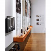
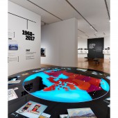
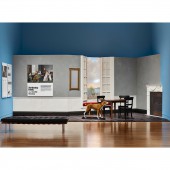
PRODUCTION / REALIZATION TECHNOLOGY: Key to the project’s success was the use of an interpretive plan outlining the goal of the learning space, as well as visitor outcomes for each of the interactive components. Initially conceived as a mood board, this document evolved into a record of content and design decisions made in line with the project’s goals and desired educational outcomes. SPECIFICATIONS / TECHNICAL PROPERTIES: 440 square meters in size divided in 8 different sections. 1. How It’s Made: Through text, images, objects and video, visitors learned about a variety of art making techniques including carving, bronze casting, beading, photography, and painting. 2. Art Can: Through examples in the collection, visitors refined their own definition of what art can be and do. 3. The Woolsey Family: Visitors were invited to step into a life-size set recreating the home depicted in the Woolsey Family portrait and take their own pictures. Text panels described how the artist composed the im- age and who the sitters were. 4. Timeline: A timeline presented on three walls pre- sented an array of facts and images highlighting impor- tant moments in the history of art in Canada. 5. Interactive Map: A large round table, 12 feet in diam- eter, presented a backlit map of Canada activated by push buttons and highlighting 13 artworks from across the country. It explained the artworks’ connection to the places they were created. 6. To Imagine the Landscape: Video projections of Canadian landscapes, including the location where Tom Thomson painted The Jack Pine, served as inspiration for visitors to create their own digital landscape paint- ings at one of 6 iPad stations. Text panels explained the development of landscape painting in Canada and the compositional elements of a landscape painting. 7. Five Fallacies about Art: To orient visitors to the CIG installation a video featuring the Director, Marc Mayer, explained the new changes to the galleries. Further to this, Mr. Mayer deconstructed five fallacies about art: art must be beautiful, art requires skill, art must have a sub- ject, art is a matter of taste, and art is a luxury. 8. Art Match Quiz: The final section offered visitors a chance to plan the rest of their visit. Floor plans and a series of self-guide brochures were made available, as were tablets where visitors could take part in a quiz to help them find their art match – an artwork on view in the galleries that might appeal to their sensibilities – along with similar artworks to explore during their visit. TAGS: Exhibition, Education, Space, Design, Interactive, Art, Visitor, Artifacts, Educational, Display RESEARCH ABSTRACT: The project was initiated, researched, conceived, designed, fabricated, and installed within a few months. We had to design, oversee and implement the layout and construction of the physical exhibition space, as well as create all visual and didactic materials with limited internal resources. Due to the compressed timeline, much of the content creation, design and fabrication occurred concurrently. Fabrication and graphics production were outsourced. CHALLENGE: One of the greatest design challenge was to integrate a timeline without it to be so linear. Timelines are great for reports and school projects but displayed in a linear way over a few wall can’t be monotonous for the visitors. ADDED DATE: 2018-03-17 03:52:37 TEAM MEMBERS (5) : Lead Designer / Art Direction: Stefan Canuel, Designer: Frederick Gelinas, Designer: Tim Davis Design Inc., Production Artist: Modlab and Illustrator: Rocket 57 IMAGE CREDITS: Stefan Canuel, 2017. |
||||
| Visit the following page to learn more: https://www.behance.net/gallery/61001793 |
|||||
| AWARD DETAILS | |
 |
Our Stories Exhibition by Stefan Canuel is Winner in Interior Space and Exhibition Design Category, 2017 - 2018.· Read the interview with designer Stefan Canuel for design Our Stories here.· Press Members: Login or Register to request an exclusive interview with Stefan Canuel. · Click here to register inorder to view the profile and other works by Stefan Canuel. |
| SOCIAL |
| + Add to Likes / Favorites | Send to My Email | Comment | Testimonials | View Press-Release | Press Kit |
Did you like Stefan Canuel's Interior Design?
You will most likely enjoy other award winning interior design as well.
Click here to view more Award Winning Interior Design.


