DESIGN NAME:
Nordic Bravery
PRIMARY FUNCTION:
Label and Packaging
INSPIRATION:
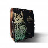
The severe and at the same time unusually beautiful nature of Scandinavia, picturesque Norwegian mountains and deep fjords, Finnish lakes with crystal clear water, mythology of the ancient Scandinavians inspired the designer to create this project. In the designer opinion, this design is unforgettable and outstanding among other designs of beer, in which the focus is on the font, not the graphic illustration.
UNIQUE PROPERTIES / PROJECT DESCRIPTION:
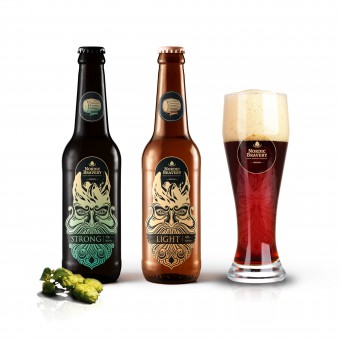
The main distinguishing feature of this project is the emphasis on visual perception of the drawing, showing the origin of the beer. While working on the label, the designer decided to use the minimum of the text and make the main emphasis on the image itself of a brave and fearless warrior. Viking helmet is a stylized image of the Norwegian mountains. This image is the embodiment of courage, which the consumer wants to enjoy while drinking this beer.
OPERATION / FLOW / INTERACTION:
This packaging design characterizes the type of product and indicates it's origin and also is able to communicate with the target audience.
PROJECT DURATION AND LOCATION:
The project was created in 2013. In Poland.
FITS BEST INTO CATEGORY:
Packaging Design
|
PRODUCTION / REALIZATION TECHNOLOGY:
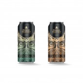
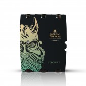
Paper label on glass bottle, beverage cans, and cardboard package
SPECIFICATIONS / TECHNICAL PROPERTIES:
Label dimensions: 65 mm x 115 mm
TAGS:
Beer, brewing, alcohol, beverages, beer design, label, bottle
RESEARCH ABSTRACT:
After an analysis of the market and the target audience, the designer has decided to focus on the graphic illustration and to put the font in the background. The untypical style is based on the two Scandinavian symbols — rocky fjords and a fearless viking. The designer wanted to create a brand which would clearly be associated with excellent strong beer.
CHALLENGE:
-
ADDED DATE:
2018-02-28 22:09:39
TEAM MEMBERS (1) :
Oleksandr Pogrebniak
IMAGE CREDITS:
Oleksandr Pogrebniak, 2017.
|
