Moddaeng Motor Logo and VI by Natchamol Uasrikongsuk |
Home > Winners > #66572 |
 |
|
||||
| DESIGN DETAILS | |||||
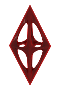
| DESIGN NAME: Moddaeng Motor PRIMARY FUNCTION: Logo and VI INSPIRATION: Moddaeng (Thai name) comes from the name of Superhero in Japanese comic, Heisei rider, who always ride his motorcycle to save people & the world. The word "Mod" means ants in English, so there is a combination design of Superhero and ant in this design. Both Superhero & Ant’s personality expresses the company culture: Superhero’s stands for friendly, trustworthy, reliable, integrity; while Ant’s adds on teamwork, family, and loyalty. MD logo was developed under the purpose of building brand image and recognition. The logo must represent its business ,service, and culture in a professional way. UNIQUE PROPERTIES / PROJECT DESCRIPTION: Moddaeng is in a motorcycle business with multi-service segments including Motorcycle dealers, leasing, second hand motorcycle, transportation, maintenance & after-service with more than 250 branches in Thailand. Therefore, they need a company logo that will represent its business, as well as increase a brand recognition for consumers to easily find them in different regions. For logo design, there is a combination between 1) symbol logo & 2) logotype. The symbol logo (MD): we keep the concept of super hero, while create the logo design to be more modernize & international. Logotype (Moddaeng): The word (Mod) in English means ants. Therefore, we developed first lettering design by using the characteristics of ant’s "Mandibles” as our inspiration. In addition, the graphic elements are developed by the shape of Motorcycle’s chain, and its pattern is designed as "flag of chess” to present the mood & tone of motor racing. We decided to use red/black/metallic color in logo design to create the look of profession and reliability. OPERATION / FLOW / INTERACTION: The logo and integral VI system will be applied to visual displays in store & events, signages, advertising, and merchandise items. PROJECT DURATION AND LOCATION: The project started in December 2015 and finished in May 2016, in Thailand. FITS BEST INTO CATEGORY: Graphics, Illustration and Visual Communication Design |
PRODUCTION / REALIZATION TECHNOLOGY: Mix media SPECIFICATIONS / TECHNICAL PROPERTIES: 1.5x1.5x0.25 m. Low relief Logo (MD& outline) made of stainless steel. Die cut. Background: metallic red (Pantone 1795 C) TAGS: logo, corporate Identity, brand identity, visual communication, graphics RESEARCH ABSTRACT: From the research of wording "Hero", we get the definition that Hero is a normal person, who has courage to fight for goodness and for others. Superhero's characteristics can be translated into these: trustworthy, integrity, teamwork, loyalty, friendly, service, loyalty. In Thai society, the company with high morality and great service tends to get a great compliment from customers. Moddaeng believes that by keeping its name of Superhero and providing great product & service (like Superhero) will bring a strong brand experience and true bonding with customers. Therefore, Moddaeng requires the new logo design that represents its brand image relating to Superhero that the society admire to. CHALLENGE: Superhero represents a hero that always sit in people’s heart. Our challenge is to develop the design that we can add the sense of Superhero while representing the company culture and business. It should represent modernness, speediness, trustworthy, professional and reliability in the creation. ADDED DATE: 2018-02-28 18:58:56 TEAM MEMBERS (2) : Korya Kosukwattana and IMAGE CREDITS: Image #1 : freedesignresources.net Image #3,4: free-psd-templates.com Anaone Studio 2017 Video credits: Creator Natchamol Uasrikongsuk, 2016. PATENTS/COPYRIGHTS: Copyrights belong to Natchamol Uasrikongsuk, 2016 |
||||
| Visit the following page to learn more: http://anaone.com/NH_2016/CI_MD_moddaeng |
|||||


| CLIENT/STUDIO/BRAND DETAILS | |
 |
NAME: NH Studio PROFILE: Moddaeng is in a motorcycle business with multi-service segments including Motorcycle dealers, leasing, second hand motorcycle, transportation, maintenance & after-service with more than 250 branches in Thailand. Therefore, they need a company logo that will represent its business, as well as increase a brand recognition for consumers to easily find them in different regions |

| AWARD DETAILS | |
 |
Moddaeng Motor Logo and Vi by Natchamol Uasrikongsuk is Winner in Graphics, Illustration and Visual Communication Design Category, 2017 - 2018.· Read the interview with designer Natchamol Uasrikongsuk for design Moddaeng Motor here.· Press Members: Login or Register to request an exclusive interview with Natchamol Uasrikongsuk. · Click here to register inorder to view the profile and other works by Natchamol Uasrikongsuk. |
| SOCIAL |
| + Add to Likes / Favorites | Send to My Email | Comment | Testimonials | View Press-Release | Press Kit |
Did you like Natchamol Uasrikongsuk's Graphic Design?
You will most likely enjoy other award winning graphic design as well.
Click here to view more Award Winning Graphic Design.
