Turning Office space by MII-Design |
Home > Winners > #66375 |
 |
|
||||
| DESIGN DETAILS | |||||
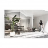
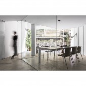
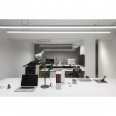
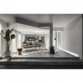
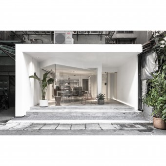
| DESIGN NAME: Turning PRIMARY FUNCTION: Office space INSPIRATION: With the design of turning the original interior space by 45 degrees, trapezoid and triangle space were created as an interesting area, releasing the flat single axis of the street previously. The space could be street(public area) and the extension of the interior(private area). The exposed beam and column imply the fact that it was formerly the line for private area, and the original interior space is released and connected to the street. UNIQUE PROPERTIES / PROJECT DESCRIPTION: The original site was a long and narrow space without windows, and the roller door blocked natural light. Thus, the space was gloomy, and the interior and exterior space was totally disconnected. It was even harder to have natural light in the office and conference room. Transparent glass square box would be a great solution to allow natural light to come into the space of conference room and office. OPERATION / FLOW / INTERACTION: Two trapezoid spaces were created with the design of turning the original interior space by forty-five degrees. The one facing outdoor turned into a little park with plants and offers a space for employees' leisure time and for interaction with neighbors, while the other one for inner space served for a transitional space for entrance as the concept of "entryway" in oriental culture which balances the interior and exterior space. PROJECT DURATION AND LOCATION: The project started in February 2017 and finished in May 2010 , and was location in Taiwan taipei. FITS BEST INTO CATEGORY: Interior Space and Exhibition Design |
PRODUCTION / REALIZATION TECHNOLOGY: Since pure white appearance would stain easily from the rainy environment of Taiwan, paint with weatherability is specially selected to avoid taint. In order to create the glass box of the conference room in a tidy and simple way, large scale of toughened glass was applied to reduce cutting lines. SPECIFICATIONS / TECHNICAL PROPERTIES: The site of this case is located at the ground floor of the building, and it covers an area of 105 square meters. The backward hinterland shaped by the wall and the glass conference room opens the view which was blocked from the narrow alley and provides an extra shelter and buffer area for the rainy monsoon weather of Taiwan. TAGS: Different Street View, Design by Subtraction, Experimental Space, Reverse the Concept, Less is More RESEARCH ABSTRACT: The continuos extension of interior space pushing to the street and roller doors that cut down the connections between people are the common street view of Taiwan. We hope to blur the stiff boundary of private and public area with experimental space and to explore different possibilities for interior(life) and streets(society) from the view of architecture. CHALLENGE: Security was the biggest concern in the process of design. We were greatly used to the sense of security from the usage of grille, so the imagination of security needed to be transformed gradually for a totally open and transparent space. With the technology of security system and the trust for people, lowest visual intervention was applied for protection, and there were nothing stolen and no accidents since then which proves stiff grille is not the only solution for safety. ADDED DATE: 2018-02-28 11:57:15 TEAM MEMBERS (5) : Designer: Tai, Po Yu , Designer: Chuang, Chih Chieh, Designer: Chang, Yen Chieh, Designer: Xiao, You Chen and Designer: Chen, Liang Chi IMAGE CREDITS: Photographer Andy Chang, ANDY's Photography , 2017 PATENTS/COPYRIGHTS: Copyrights belong to MII-DESIGN, 2017 |
||||
| Visit the following page to learn more: http://www.mii-studio.com/ | |||||
| AWARD DETAILS | |
 |
Turning Office Space by Mii-Design is Winner in Interior Space and Exhibition Design Category, 2017 - 2018.· Press Members: Login or Register to request an exclusive interview with MII-Design. · Click here to register inorder to view the profile and other works by MII-Design. |
| SOCIAL |
| + Add to Likes / Favorites | Send to My Email | Comment | Testimonials | View Press-Release | Press Kit |

