DESIGN NAME:
Calx Station
PRIMARY FUNCTION:
Logo and VI
INSPIRATION:
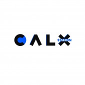
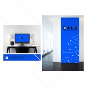
Young brand logo needs to be concise, conducive to communication, and also needs impact, to deepen brand memory and recognition. From these perspectives, the designer team choose company’s English name as the main body of the logo, maximizes the communication and integrates the auxiliary words. In the form, we believe less is more, creating a simple line bold font, square and radian full to ensure the strength and fashion of the logo. The combination of high saturation blue and black is preferred by young people, bright eyes and strong impact. The details processing gradient white, increases the future feeling and making the logo whole more stereo.
UNIQUE PROPERTIES / PROJECT DESCRIPTION:
Calx Station is a professional brand service company dedicated to brand integrated marketing/artist KOL resources/IP development/graphic design. Most of the customer brands of service tend to be young, trendy and fashionable and so are the biases of corporate culture. Therefore, the first requirement of logo design is to show young, bright and fashionable visual perception.
OPERATION / FLOW / INTERACTION:
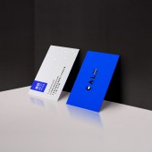
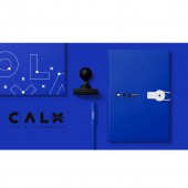
The logo can be used to print the original document, or a special process of production. This requires the completion of the guidance of the designer.
PROJECT DURATION AND LOCATION:
The project started in July 2017 in Beijing and finished in December 2017 in Beijing.
FITS BEST INTO CATEGORY:
Graphics, Illustration and Visual Communication Design
|
PRODUCTION / REALIZATION TECHNOLOGY:
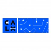
Calx Station is an advertising company tends to young and fashionable culture from customers to employees. Therefore, the first requirement of logo design is to show young, bright and fashionable visual perception. The form needs to be concise and powerful, but not breaking the stable of company’s service type, at the same time we use the color which jump off the routine to attract eyeballs. The auxiliary graphics are also arranged with the lines of the logo, and the geometric figures are decorated, this blue and white color is simple and clean, and the logo is used to reflect the image of younger and fashionable enterprises.
SPECIFICATIONS / TECHNICAL PROPERTIES:
It is a logo design, no size restrictions, can be produced according to need.
TAGS:
Advertising , Media , Fashion , Logo , VI
RESEARCH ABSTRACT:
As a young company that serves the brand, profession ls one of the important factors to attract corresponding types of customers. Both in choice of color and Logo form arrangement are all the primary needs of customers, our choice of blue color is loved by youth in fashion culture for a long time, the font also more refinement.
CHALLENGE:
Simple design is easy to be ordinary and unable to jump out of the public, we need to dig special memory points to enrich the logo, at the same time not making it too complicated
ADDED DATE:
2018-02-28 09:58:15
TEAM MEMBERS (1) :
Vin Wen , Xi Chou , Yinan Lyu
IMAGE CREDITS:
Vin Wen
|
